Discover legacy content from FontShop.com, preserved for your reference.
Welcome to our interview and Fontlist series as part of the FontShop Celebrates: Women in Design week. During this series we interviewed a few of our favourite female designers. We then asked them to compile their own Fontlists of their top type picks, giving reasons as to why those particular faces tickled their fancy.
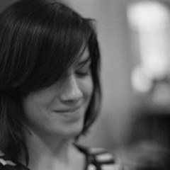
Next up is Slávka Pauliková, editorial, book and type designer.

What drew you to book design in the first place?
Slávka Pauliková | “I have always been a fan of simplicity, for example black and white and minimalistic typography. As a result when I began studying, I started to focus on book design. I enjoy the entire process of designing books; I like to give information a visual flow, preparing it digitally, and choosing the material and binding for production.”
How have eBooks changed the way you design, if at all?
Slávka Pauliková | “As of yet eBooks have not had an impact on my design process. Designing a book for print or a book for digital is pretty similar. It is equally important for both to show the information in a logical way, using the right typography and layout. Lately I have noticed an increased simplicity in book typography which I believe reflects the fact that digital typography has to be simpler. I also think that online magazines have a bigger influence on design than eBooks, especially in regards to changes in the design of printed magazines.”
If there is one book that you could take with you to a desert island, what would it be?
Slávka Pauliková | “I would definitely take a book about how to survive on a desert island!”

You worked with Joost Grootens in his studio in Amsterdam for a number of years. What was the most interesting project whilst you worked there?
Slávka Pauliková | “The majority of projects I worked on with Joost were very interesting and diverse. I think the most unique was the design of the new Dutch Van Dale dictionary, which will be published at the end of this year. It was a great opportunity to see how such an extensive book takes shape. It takes more than five years to design and produce the dictionary. I was collaborating closely with Joost, especially on the typography.”
Having lived in a number of countries including Slovakia, the Czech Republic and now The Hague, is there another place in the world were you would love to live?
Slávka Pauliková | “At one point I also spent some time in Berlin, which was great as well! However, my next stop will be Istanbul. My boyfriend and I have decided to move there as he is from Istanbul but he has been living abroad for the last twelve years. For both of us, but especially for me, it will be a new city and culture to discover. I am used to living in different countries, cities and surroundings. Even though I like big cities I also enjoy the countryside, so finding the right balance is important! Let’s see how this will work out in a metropolitan city like Istanbul.”

If you could push the current boundaries of print, what would you experiment with when designing your next book?
Slávka Pauliková | “Implementing some kind of ‘holographic technology’ within a book, that would be a pretty advanced and interesting aspect to consider. I’d like to experiment with that and see to what point this kind of technology is already viable.”
Who would you love to design a custom typeface for?
Slávka Pauliková | “Designing a typeface for NASA or any other space agency would be a great challenge! Not only because of the technological side, but also for the diversity of the multiple applications – from huge space ships to small digital led panels through to printed information materials.”
Discover Slávka’s work on her personal website, and her Favourite typefaces in her specially compiled Fontlist.


