Discover legacy content from FontShop.com, preserved for your reference.

Albert-Jan, when you originally started working on the FF DIN® typeface family, did you have any idea it would become so immensely popular?
Albert-Jan Pool | “Of course I had no clue. However, what most people don’t realise is that FF DIN was no overnight success. It took a good five years for the fonts to start gaining traction. The family only started to become popular once we added the Condensed weights and the italics. Apparently just the upright weights were not enough, and FF DIN needed to be expanded to make the type family really useful and successful. The Round weights further added to the versatility of the family.”
Inka, when did you get involved in the development of FF DIN?
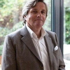
Inka Strotmann | “My first contact with FF DIN was right when I started working at FontShop International, about 15 years ago. I became in charge of the ‘normal’ production work for Albert’s fonts. It all started at the ATypI conference in St. Petersburg in 2008 where some people from FontShop and specifically the FontFont Type Department had a meeting with him. Albert is a very busy man. We wanted to help him get things done faster and finish his work on FF DIN so that we could release the typefaces. Because we had collaborated before and we worked together well, he agreed that I was going to be his invisible little helper.”

What was your initial role in the collaboration?
Inka Strotmann | “At the beginning I added missing characters in the FF DIN family for the expanded character set and I drew the Condensed Italic. Albert himself often did some fine-tuning of the drawings. However my main responsibility was to assist him, to look after any ongoing project we were working on at that moment and to obstinately ask for feedback and results. I basically was the one making sure things were getting done in time. To achieve this I started visiting Albert at his office in Hamburg. These meetings were always very fruitful – we discussed the work I did, we clarified possible problems and also resolved any tricky issues together.”

Has your role evolved since those early days?
Inka Strotmann | “During the years we have worked together I breathed in so much of FF DIN’s DNA that I am now able to help Albert considerably more. He has become the art director and I am the designer executing his ideas, much like Erik Spiekermann collaborates with other typeface designers to produce his font families. We started extensively documenting our work on FF DIN, making tons of test prints (just ask our interns… they had to make all those prints and mail them to Albert). Albert reviewed nearly every single glyph and drew up design rules for drawing new ones. Our collaboration has become very close – personal meetings in his Hamburg office, corrections on the printouts via mail, and lots of telephone calls.”
“For the latest expansion I had the honour of drawing the two new Thin and Extralight weights for FF DIN following Albert’s instructions and specifications. This expansion made us decide to update the entire typeface family and optimise a lot of things too. I now had the freedom to offer new suggestions for FF DIN, but everything was always reviewed by Albert and he makes any final decisions.”

[link not found]
Albert-Jan, with regards to expanding FF DIN, how far do you think you could take this family?
Albert-Jan Pool | “In theory you could extend the typeface indefinitely. Take a look at Corporate™ A·S·E for example, the super family Kurt Weidemann developed for Daimler Benz. It has a serif (Corporate A stands for Antiqua), a sans serif (Corporate S stands for Sans), and a slab serif (Corporate E stands for Egyptienne). Similarly you could add a serif version, a round slab serif, and so on… There is a lot of potential and you can go really far with this.”
So you don’t feel you can take it too far, beyond the core concept of FF DIN?
Albert-Jan Pool | “Not exactly, no. As long as the basic structure of a given typeface is relatively conventional and the skeleton of the characters allow for it, anything is possible. Of course, due to the aesthetics of the original FF DIN a serif version would become rather mechanical, with a specific range of possible applications, just like FF DIN itself.”

What do you think of other contemporary interpretations of DIN Mittelschrift?
Albert-Jan Pool | “I think it is interesting to see how Apple® tried to ride the coat tails of FF DIN’s popularity. It was definitely a good idea to replace the Neue Helvetica® Light font. Simply choosing a bolder weight would already have improved the legibility. Instead they preferred to have a new typeface family designed. Their new system font San Fransisco clearly goes in the direction of a DIN typeface, yet it does not take advantage of specific aspects that make DIN a legible typeface. Designing characters such as a, e and s as well as the numbers 3, 6, 8 and 9 with apertures smaller than those in DIN do not really improve on Neue Helvetica. When you consider reading on an iPhone means small type sizes in often poor reading conditions, this is a missed opportunity. Apple is design-driven, but contrary to many of their other solutions, in this case they clearly wanted to follow a trend instead of finding a solution that takes full advantage of both function and form. A humanist sans serif in the vein of the Verdana® or Frutiger® typefaces would have been easier to read and a better fit as a system font.”

Your work on FF DIN branched off into a PhD thesis.
Albert-Jan Pool | “I have been working on my thesis since 2008. It consists of a historic investigation into the roots of the DIN typeface. Many people – including myself – were wondering where it originally came from and I was frequently asked about it, but nobody knew. In January 2004 I was invited to talk at the Leipziger Typotage where 26 type designers were asked to tell something about a typeface. The conference was to be held in July; because I still had half a year, I thought: ‘Well, I can research DIN Mittelschrift (a medium weight) and turn it into a nice presentation’. Yet I quickly found out this was extremely hard as there was almost no information available. The result was a humorous talk called Dutch Type made in Germany which incorporated many ironical remarks about ignorant engineers trying their hand at typeface design. Fortunately Indra Kupferschmid and Martin Binder told me they knew little bits of its history, enough for me to tell an interesting story with more in-depth information at TYPO Berlin 2005. This is where the idea originated to start doing serious research.”
“In 2006 I submitted a proposal to the KABK. I was told I could not enroll the Type & Media postgraduate because this required me to be present full-time. You cannot do it remotely: the program thrives when all the students are present and working together. They suggested they had something in the pipeline and asked me to wait a few months. Gerard Unger was appointed Professor of Typography and I officially got started in 2008. Of course I was primarily interested in the historical part, but Leiden doesn’t do history, so my research also needed to include an artistic component. This made me investigate the technical aspects, because they inform the shapes of the characters and influence the aesthetic qualities of the typeface.”

Did this research change your view of DIN and make you look at your own digitisation in a new light?
Albert-Jan Pool | “Not really. When I began my work on FF DIN I started by loosely digitising DIN as is, based on the printed drawings you can purchase as Norm-sheets. I subsequently created a preliminary version of the black weight by emboldening my digital version of Mittelschrift. This allowed me to extrapolate a lighter version. Achaz Reuss, who did FF QType® and the Nivea corporate face, finished the light weight, and I designed the black weight. I interpolated and fine-tuned the family, did the kerning and so on. This gave the design my signature style, though I tried not to add too much of my personality so it could become a timeless typeface. I drew it with very little ego; otherwise it becomes too much of an interpretation – like the ITC Conduit® typeface for example – and you need to give it a different name. ITC Conduit is a fun typeface in its own right but has very little in common with DIN. Every bizarre and crazy aspect was exaggerated. This made it the perfect headline face for a specific timeframe, but also made it fade into the background when people got a little tired of it. Keeping that clean, rigid and still ‘normal’ look-and-feel has always been an important design constraint. Therefore I feel very happy about the way Inka teamed up with me. I collaborated with the designers creating the language extensions in a similar way. Panos Harantzopoulos and Yiannis Karlopoulos for the Greek, as well as Alexei Chekulaev and Alexey Gunin for the Cyrillic managed to find that delicate balance between staying faithful to the conventions of their script and FF DIN as a typographic concept.”

To me personally DIN seems distant and technical. How do you experience its character shapes?
Albert-Jan Pool | “We see what we want to see. People who have a love for industrial archaeology and trains and highways and those sort of things will view the typeface differently. For those people DIN is a symbol. This effect constitutes a tremendous advantage for me, as they will license my typeface literally because it is called DIN. However if you focus on the aesthetic quality, the rigidity of the lines and arcs in the drawings of an engineer, this changes the narrative. For those people, like for example Cornel Windlin and Stephan Müller of lineto, only the original DIN font is the ideal, my interpretation just about passes muster, and every other digitisation has little to do with their idealised view on the typeface. On the other hand we now have the DIN Next™ typeface. It takes more or less the opposite approach by clearly attempting to ‘humanise’ DIN more than I did. DIN Next still takes advantage of the name DIN, but it has less in common with the original. It is a bit like the ITC Garamond™ typeface – while you may find it a good typeface, it admittedly has little to do with the intentions of its originator Claude Garamond. From that point of view the Stempel Garamond™ and notably Sabon® Next typefaces are much better interpretations.”

How do you view DIN in a cultural context?
Albert-Jan Pool | “In Germany you will find people who find DIN beautiful on the one hand, but on the other hand others have mixed feelings about its identity and what it embodies. French people can be very proud of their country, the Dutch too, the Belgians sort of (laughs), the US definitively think they are the greatest nation on earth, but the Germans have somewhat ambiguous feelings. What struck me is that in the European countries outside Germany, notably in France who had serious problems with Germany – four times between the battle Waterloo in 1815 and the end of WWII in 1945 – institutions like the Centre Pompidou and the Eiffel Tower use FF DIN for their graphic identity and they just love it. 50 years ago or even 30 years ago nobody could have fathomed that a French national would ever use a German typeface. And in the Netherlands just as well. If you ask the Dutch about the Germans everything is fine as long as they do business, but for the rest all those legends and past grudges keep surfacing. Yet the National Library of the Netherlands uses FF DIN as its corporate typeface, in orange! (laughs) Back when Queen Beatrix married Prince Claus this would certainly have caused a national scandal. Fortunately these things don’t play any significant role anymore, and it very interesting to observe how these cultural connotations and significations evolve over time. Jan van Krimpen and Ovink figuratively stood on the barricades when the Germans tried to introduce DIN 1451 for the traffic signs in the Netherlands during the second World War, but if this happened now most people would say: ‘Hey, how interesting.’ It’s crazy how things change.”
Photos by Max Zerrahn