Discover legacy content from FontShop.com, preserved for your reference.

Version originale francophone de l’interview à la fin de cet article. [link not found]
When did you get bitten by the typography bug?
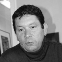
Grégori Vincens | “I had two ‘clicks’ in my youth. The first one happened in 1987 when I was in primary school; I was 11 years old. My grand-father gave me a book about the invention of writing called “L’histoire commence à Sumer” which translates as “History begins in Sumer”. It made a very big impression on me – the clay tablets representing Sumerian pictograms that gradually transformed into cuneiform writing thoroughly fascinated me. The fact that the invention of writing heralds the transition from prehistory to history added an initiation-like dimension to my discovery of the original beauty of the sign and the letter.”
[link not found] [link not found] [link not found]
“The second came in high school during my Applied Arts studies, when my graphic design teacher gave me a Mecanorma catalogue as a present. I started leafing the pages, meticulously, even obsessively examining the alphabet showings for hours, day and night. I never abandoned typography since, and this physiological, quasi carnal relationship with character shapes still continues to develop in me every single day.”
At what point did you start drawing type?
Grégori Vincens | “I entered the École Estienne in 1994 with the firm intention to learn type design, applying at the DSAA Typeface Creation of the school. So I started to study calligraphy on an autodidactic basis, then I moved on to drawing my first words, my first ‘Hamburgefonstiv’. All this was done by hand on tracing paper of course. Vectorisation was a goal that eventually had very little importance to me. I was constantly searching for the right shape, exploring this new matter which to me was like an object that I could chisel, model, sculpt. It allowed me to assemble a personal dossier of typographic creations that I now look at with sly smile for its naivety, even though there already was some rigor after all.”
“This dossier allowed me to enroll at the Atelier National de Recherche Typographique and to start my apprenticeship with Franck Jalleau and Michel Derre, my ‘Latin’ mentors who ultimately became friends. I continued my apprenticeship at the ANRT), this time with my ‘Swiss’ guides Peter Keller, Jean Widmer and Hans Jurg Hunziker. During that period I participated in the Erasmus program which brought me to the KABK in The Hague where I studied under Peter Verheul and Fred Smeijers.”
“Having barely graduated I eventually had the opportunity myself to teach typography and design from 1998 to 2002, at the ESAD Amiens, the ECV – École de Communication Visuelle and the ESAG Penninghen.”


What is the relationship between your agency 4uatre and Fontyou?
Grégori Vincens | “I was barely out of school when I created the agency with two designer friends, so my passion for type design never left me. It is this culture of typographic ‘savoir-faire’ that sets our output at 4uatre apart from most other French agencies. The power of the sign and its semantic inventiveness, its structure and its simplicity remain the ultimate quest for us and all the designers in the agency. We were fortunate to meet clients who allowed us to express ourselves creatively and typographically on a wide range of media – publications, branding, motion design, packaging, digital. In a very organic way this led to the development of custom typefaces for large identity programs like SFR, La Fondation Nicolas Hulot, FRAM, Promotelec, Dassault Systèmes, Médiamétrie… However Fontyou has no economic tie to the 4uatre agency. They are two distinctly different entities. The only thing connecting them is a passion for typography and the sign.”

[link not found]
So where did the idea arise to create a type foundry?
Grégori Vincens | “That was a lifelong dream of mine, ever since graduating from the École Estienne. I was probably right not to start it up immediately and to wait until I better understood the habits and needs of everyday users of typefaces. My 15 years of experience in design allowed me to observe first. The typographic industry is very much self-centered, sometimes even dogmatic and elitist. I have little interest in other type designers’ opinion about type design, but in what interests the users. This gave me the idea to place the designer, not the typographer, first in the typeface development process. This fueled the creation – together with my partners – of Fontyou, the first collaborative type foundry operating on a technological platform that is unequaled to this day. After one-and-a-half years of activity we have thanks to a community of over a thousand users initiated 1300 type design projects, finalised and distributed more than 330 fonts in 70 families, co-created by 30 designers. I deeply believe in the collective intelligence resulting in strength in numbers, especially when it comes to artistic creation.”
“Today Fontyou is more than just a foundry – it is a global experience catered around typography, its use and its distribution. Like any startup focusing on innovation and users we continue to develop new tools. We have integrated our collaborative co-creation platform into a larger ecosystem constituting of a novel Cloud-based Type Management system (still in beta), and a platform of typographic content dedicated to creative professionals. Every day we continue to stay in touch with our users, our community, and to observe a creative market that is in full digital mutation.”
[link not found] [link not found]
Can you go more into detail how this collaborative type design platform works?
Grégori Vincens | “Designers can post two kinds of projects. First we have what we call a “type idea” – a typographic concept, or a rough sketch, or one or several hand-drawn words, or some vectorised letters. Then they can also submit a “type project” – for us that is a more elaborated typographic project consisting of at least 15 vectorised characters. If we like the idea, we ask the designers to register on the platform, and investigate whether they are motivated to draw more glyphs or if they feel sufficiently confident to develop the alphabet by themselves. Depending on their answer, we encourage them and act as mentors and artistic directors, giving advice and guiding them through the process. We do this using innovative multi-user tools, like the online vector drawing tool, real-time comments, and so on. The designers have to tag every glyph they post with the ‘crop-glyph’ tool to make it easier for us to follow-up their project day-to-day. When a project is selected we ask permission from the designers to turn their files into completed digital typefaces. Depending on how much work they did on the fonts each co-creator can earn from 5 up to 55% in royalties on the retail sales.”

What does the future bring for Fontyou?
Grégori Vincens | “We put our technological knowhow at the heart of our business project. Our goal is to cover the entire value chain, from the creative process all the way to providing innovative font management tools for designers as well as big agencies and international brands. The difference in value proposition is our collaborative and social approach. This is where the Fontyou’s DNA stems from. Fontyou’s future is also international – our commercial development and marketing spreads more and more into both Americas and of course Europe. Fontyou has always been a technological enterprise, yet one that expands its business from design to software.”

To conclude – I cannot help myself, but I need to know. Were you never concerned that English speakers could be misinterpret Fontyou as that other F-word?
Grégori Vincens | “Our name won a honorable mention at the Grand Prix Stratégies du design 2013, in the Naming category. It’s a fun name that lends itself to wordplay and humorous interpretations. What counts in the Fontyou name is the ‘you’. We are definitively user-centric. We work on the experience of our product using agile software development methods (customer development/scrum), while listening to the feedback from our users to better accommodate their needs. And we are a start-up with a fun attitude, doing serious things without taking ourselves too serious, and for who type has to be cool.”
Version originale francophone de l’interview après l’image ci-dessous.

Comme j’ai fait l’interview en français, FontShop offre le texte original à nos lecteurs francophones. [link not found]
Comment as-tu as découvert ton amour pour la typo?
Grégori Vincens | «J'ai eu deux déclics dans ma jeunesse. Le premier en 1987 alors que j’étais au collège. J’avais 11 ans. Mon grand-père m’a offert un livre sur l’invention de l’écriture intitulé L’histoire commence à Sumer. Ce fut un choc pour moi. Les tablettes d’argile représentant les pictogrammes sumériens, transformés peu à peu en écritures cunéiformes m’ont complètement fascinés. Le fait que l’invention de l’écriture marque le passage de la préhistoire à l’Histoire a rajouté une dimension initiatique à ma découverte de la beauté originelle du signe et de la lettre.»
[link not found] [link not found] [link not found]
«Le deuxième était au lycée, lors de mes études d’Arts Appliqués, quand mon prof de graphisme m’a offert un catalogue Mecanorma. J’ai commencé à feuilleter ces pages; j’ai observé, minutieusement, obsessionellement, pendant des heures ces abécédaires, jour et nuit. Je n’ai plus jamais quitté la typographie depuis et cette relation physiologique, quasi charnelle avec les formes des caractères continue encore chaque jour à se développer chez moi.»
Quand as-tu commencé à faire du dessin de caractères toi-même?
Grégori Vincens | «Je suis rentré à l’École Estienne en 1994, avec la ferme intention d’apprendre le dessin de caractères, donc d’intégrer le DSAA création typo de l’Ecole. J’ai commencé à étudier la calligraphie en autodidacte, puis j’ai dessiné mes premiers mots – mes premiers “Hamburgefonstiv” – à la main évidemment, sur calque. La vectorisation n’étant qu’un aboutissement assez peu important pour moi au final. J’étais en recherche constante de la bonne forme; je tatonnais cette nouvelle matière qui était pour moi comme un objet que je pouvais tailler, modeler, sculpter. J’ai ensuite constitué un dossier personnel de créations tyographiques, que je regarde maintenant avec un léger sourire tant il y avait de la naiveté, mais malgré tout, déjà un peu de rigueur!»
«Ce dossier m’a permis de rentrer à l’Atelier National de Recherche Typographique et de commencer mon apprentissage avec Franck Jalleau et Michel Derre, mes mentors “latins” devenus maintenant mes amis. J’ai poursuivi mon apprentissage à l’ANRT, avec cette fois-ci mes guides “suisses” Peter Keller, Jean Widmer et Hans Jurg Hunziker. Entre-temps j’ai suivi quelques mois de formation Hollandaise en Erasmus, à la KABK de La Haye avec Peter Verheul et Fred Smeijers.»
«Ensuite j’ai eu la chance, alors que je finissais à peine mes études, d’enseigner à mon tour la typographie et le design de 1998 à 2002, à l’ESAD Amiens, à l’ECV – École de Communication Visuelle et à l’ESAG Penninghen.»
Quelle est la relation entre ton agence 4uatre et Fontvou?
Grégori Vincens | «Quand j’ai créé l’agence en 2002 avec deux amis designers, je sortais quasiment de l’école. Mon métier de dessinateur de caractères ne m’a jamais quitté. C’est d’ailleurs grâce à cette culture et ce savoir-faire typographique que la production de 4uatre est surement un peu différente de celle des autres agences françaises. La force du signe, son inventivité sémantique, sa structure, sa simplicité reste la quête absolue pour nous et pour tous les designers de l’agence. Nous avons eu la chance de rencontrer des clients qui nous ont laissé nous exprimer créativement et typographiquement sur differents médias: l’édition, le branding, le motion design, le packaging, le digital. C’est donc tout à fait naturellement que nous avons pu développer des polices sur mesure dans le cadre de gros programmes identitaires (SFR, La Fondation Nicolas Hulot, FRAM, Promotelec, Dassault Systèmes, Médiamétrie, …). Fontyou n’a aucune relation capitalistique avec l’agence 4uatre. Ce sont deux sociétés distinctes dont l’actionnariat est différent. La seule chose qui les lie est la passion de la typographie et de la marque!»
[link not found]
D’où est venue l’idée de créer une fonderie typo?
Grégori Vincens | «En fait j’ai toujours voulu créer une fonderie typo, depuis ma sortie de l’Ecole Estienne. J’ai probalement eu raison de ne pas la monter tout de suite, et d’attendre pour comprendre d’abord les usages et les besoins de ceux qui utilisent au quotidien les caractères. C’est ce que l’expérience de 15 ans de design m’a permis d’observer. L’industrie de la typo est très centrée sur elle-même, elle est parfois dogmatique et élitiste. Ce n’est pas ce que les autres dessinateurs de caractères pensent de la création typographique qui m’intéresse; c’est ce qu’en pensent les futurs utilisateurs. J’ai donc eu l’idée de mettre le designer, non typographe, en amont du processus de création d’un caractère, en créant avec mes associés Fontyou, la première fonderie collaborative, fonctionnant sur une plateforme technologique inédite à ce jour. En un an et demi d’activité, nous avons, grâce à une communauté de plus de 1000 personnes, initiés plus de 1300 projets de caractères, finalisé et distribué plus de 330 fontes (70 familles) co-créées par 30 designers. Je crois profondément à l’intelligence collective. Nous sommes toujours plus forts à plusieurs, surtout quand il s’agit de création.»
«Mais aujourd’hui Fontyou est plus qu'une fonderie, c’est une expérience globale autour de la typographie, de ses usages, de sa circulation. Comme toute startup technologique qui met l’innovation et l’utilisateur au centre de ses missions, nous continuons à développer de nouveaux outils. Nous avons donc intégré notre plateforme de co-création au sein d’un ecosystème plus large, constitué d’un outil inédit de Type Management en Cloud, encore en Bêta, et d’une plateforme de contenus typographiques dédiés aux professionnels de la création. Nous continuons donc, chaque jour, à rester au contact de nos utilisateurs, de notre communauté, et à l’écoute d’un marché de la création en pleine mutation digitale.»
[link not found] [link not found]
Peux-tu m’expliquer comment marche le système de co-création?
Grégori Vincens | «J’ai un texte en anglais pour cette partie. ;)»
“Designers can post two kinds of projects. First we have what we call a “type idea” – a typographic concept, or a rough sketch, or one or several hand-drawn words, or some vectorised letters. Then they can also submit a “type project” – for us that is a more elaborated typographic project consisting of at least 15 vectorised characters. If we like the idea, we ask the designers to register on the platform, and investigate whether they are motivated to draw more glyphs or if they feel sufficiently confident to develop the alphabet by themselves. Depending on their answer, we encourage them and act as mentors and artistic directors, giving advice and guiding them through the process. We do this using innovative multi-user tools, like the online vector drawing tool, real-time comments, and so on. The designers have to tag every glyph they post with the ‘crop-glyph’ tool to make it easier for us to follow-up their project day-to-day. When a project is selected we ask permission from the designers to turn their files into completed digital typefaces. Depending on how much work they did on the fonts each co-creator can earn from 5 up to 55% in royalties on the retail sales.”
Quel est le futur de Fontyou?
Grégori Vincens | «Nous mettons l’expérience typographique au cœur de notre projet d’entreprise. Notre objectif est de couvrir l’ensemble de la chaine de valeur, de la création jusqu’à la mise à disposition d’outils innovants de gestion des fontes pour les designers comme pour les grosses structures de type agence ou marques. Ce qui fait la différence de notre value proposition, c’est l’approche collaborative et sociale. L’ADN de Fontyou vient de là. Le futur de Fontyou c’est aussi l’international. Notre développement commercial et marketing s’étend de plus en plus dans des zones comme les Amériques, et bien sûr l’Europe. Fontyou a toujours été une entreprise technologique mais qui étend de plus en plus son métier, du design vers le logiciel.»
Pour conclure – tu ne t’es jamais fait des soucis que le nom Fontyou peut être mal compris en anglais, par cet autre mot commençant aussi avec un “f”?
Grégori Vincens | «Notre nom a gagné une mention au Grand Prix Stratégies du design 2013, dans la catégorie Naming. Dans Fontyou ce qui compte c’est le YOU. Nous sommes définitivement user-centric; nous travaillons l’experience de notre produit, selon les méthodes de developpement informatique agile, (customer development/scrum) en écoutant les besoins et feedbacks de nos utilisateurs afin d’être les plus proches de leur besoins. Et nous sommes un startup, fun, qui fait des choses sérieuses sans se prendre au sérieux, et pour qui la typo doit être cool.»