Discover legacy content from FontShop.com, preserved for your reference.
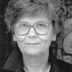
Unable to return to her family’s home in Potsdam, in the turmoil of post-war Germany, Gudrun von Hesse moved to a small Hessian town in late 1945.* Equipped with a portfolio, she introduced herself at the Bauer Type Foundry, based in Frankfurt am Main. It was foundry director Georg Hartmann himself who gave her the opportunity to maintain an in-house hand bookbindery, with permission to work for other clients as well. At Bauer, GZvH met art director Heinrich Jost and type designer Konrad F. Bauer and learned much about the manufacturing process of metal type. Her kind nature was much appreciated and her skills were highly valued. Jost praised her as “a perfect hand-bookbinder” (in a letter of recommendation, 24 February 1947).
Eventually, GZvH was brave enough to approach the punch cutters at Bauer. Punch cutting was not practiced by women until that time – if there were exceptions, they are remarkable. Engraving the mirror image of a letter in a steel punch (up to six centimeters long) was the first step in the production of metal type. This was a meticulous process requiring skilled hands that carefully carved out the face of the type using gravers, files and sometimes counter punches. The final punch could be used to make an impression in a softer metal block (usually copper or iron), then known as a matrix or mat.** Essentially the matrix is the mold from which a type founder casts metal sorts.***

However, GZvH’s initial plan was not a set of cast type, but the cutting of punches that she could mount on wooden handles to use them as stamps for title lettering on leather book covers and spines – and she wanted her own design available for it. Under the guidance of punch cutter Josef Spahn, GZvH learned how to form letters in brass (bookbinder’s lettering stamps did not have to be cut in steel) with different engraving tools and with patience. Without much training, she began to work on her own capital alphabet as well as accompanying figures and ornaments in 36 point, a proper titling size. According to GZvH, no trial letters were necessary and no character was cut twice.

GZvH’s first explorations in type were self-taught early on, from books by Edward Johnston and Rudolf Koch. It was much later, in 1941, that she attended classes of Johannes Boehland in type and lettering at the Meisterschule für Graphik und Buchgewerbe in Berlin. The result of her punch cutting, finished in 1947, is a child of its time: Serif-less letterforms that have contrast and a slight emphasis on the stroke endings. Discreet shifts in contrast, most notable in the ‘S’, and obviously its hand-cut nature, lend this alphabet a certain liveliness.

The letters were first used for the titling of an anniversary book, published by the Bauer Type Foundry at the occasion of Georg Hartmann’s 75th birthday (printed in 1946, bound a year later). The name on the cover and spine is gold-stamped – a specialty of GZvH. In the following years, she produced other gold-stamped lettering broadsides as well as blind embossing using this alphabet. It became her exclusive “house face” for special occasions.


The name Hesse Antiqua was given years later by her husband, Hermann Zapf, in reference to her maiden name. Hermann Zapf and Günter Lepold, director of the Stempel Type Foundry, discovered some of her lettering work at an exhibition in 1948. Two years later one of these designs became available as Diotima, GZvH’s first released typeface. Nine typefaces for metal, photo, and digital typesetting technologies followed, released with Stempel, Berthold, Bitstream, and URW. After 70 years, Hesse Antiqua is finally released as a complete typeface, by digital means.

Hesse Antiqua’s digital manifestation
A digital Hesse Antiqua is the result of careful considerations and decisions, made in agreement with Gudrun Zapf von Hesse. While she is the type designer, my role became that of a ‘digital punchcutter’. The digital font that we are releasing today is not a revival, but the transformation of Hesse Antiqua from a lettering alphabet into a typeface – considering 70 years of changes in font technology between the two stages.

I have been curious about shaping Hesse Antiqua into a typeface with GZvH since she presented her lettering stamps to me on the first day of spring in 2015. A great challenge immediately arose in its various appearances in different ‘circumstances’: Initial drawings, the punches, smoke proofs, blind embossing, hand-stamping with gold foil. Which of these would serve as a model for redrawing by digital means? It seems, in the process of cutting the letterforms in brass, GvH disregarded some of the details that she had drafted in the earliest drawings. The resulting stamps are a trustworthy reference for letterform proportions and details, but the stamps ‘in action’ provide better evidence of her intentions. GZvH knew that the letters would lose some of their contrast when they were embossed – especially when there was ink involved.


In an early agreement between GZvH and myself, we decided that lowercase letters should not be added 70 years later, but that punctuation was necessary for contemporary applications. The font also includes a couple of ornaments from GZvH’s collection of brass punches – as such the triple-leafed branch is an homage to her popular piece Der Nachtigallenbaum (Engl. The nightingale tree). Thanks to Monotype’s design studio the font is equipped with proper small caps and several accents. GZvH does not have an e-mail address, so several journeys to Darmstadt were necessary this year to discuss progress. On one occasion she also sent corrections that she had made using white-out and black markers by ‘traditional’ mail. Figure ‘2’ was a much-discussed character.

My colleague Norman Posselt, a typophile photographer who joined me on many visits to Darmstadt, captured macro images of punches and of printed proofs that served as crisp templates for digitization. In the production and mastering phase, Monotype’s very own Bernd Volmer cleaned up my data and resolved one or two anchor points (when I say “one or two”, I mean … there were several). At last, Akira Kobayashi pointed out that all pointing strokes should be rounded off just slightly to preserve the warmth of the original Hesse Antiqua.
With the help of interpolation tools and Bernd’s font engineering skills, we determined a weight that corresponded with the original Hesse Antiqua, as GZvH envisioned it on a leather book cover. GvH developed Hesse Antiqua for 36 point and we kindly advise not to use it much smaller. It will make a great face on classic book jackets, just as much as on contemporary editorial design covers – and it is certainly well suited for posters.


Until recently, when I visited her in Darmstadt, GZvH asked me rather disbelievingly if the release of Hesse Antiqua would really happen. I am very glad we can announce it on her 100th birthday. Herzlichen Glückwunsch zum Geburtstag, Frau Zapf von Hesse!

Notes
* For a more complete biography please watch the author’s closing talk at TYPO Berlin 2016
** The information on this particular process at Bauer Type Foundry is gathered from Konrad F. Bauer’s Wie eine Buchdruckschrift entsteht, Frankfurt/Main, approx. late 1950s.
*** This skill is still practiced at Schriftgießerei Rainer Gerstenberg in Darmstadt, Germany.
This article was first published in German (with translations by Jürgen Siebert) over at Monotype.de.