Discover legacy content from FontShop.com, preserved for your reference.


 for explanation) → Found in Riga, Latvia](https://lg-assets.myfonts.com/fs/uploads/content_image/attachment/308912/mini_magick20160310-7130-1rgzwox.jpg)


The essential idea of stencils is to repeatedly display an image by applying ink or paint on a plate. Whatever shapes are trimmed away from that plate (using a knife, mortising machine, laser, etc.) will be showcased. The term stencil describes both the pattern and the image that result from it.
People more or less used this technique in reversed form over 9,000 years ago. In the famous Cueva de las Manos (Cave of Hands) in the Santa Cruz region in Argentina cave dwellers spray-painted silhouettes of their own hands on cave walls, therefore creating negative shapes. Similarly, through exposure of light, Lucia and László Moholy-Nagy and Man Ray produced their so-called “photograms” or rather “rayographs” respectively in the first half of the twentieth century.
[link not found]
Stenciling letters is a technique used to reproduce the same characters rapidly. Stencil plates can usually be connected on the side bearings to guarantee some sort of horizontal alignment of a string of words. According to Eric Kindel, who is perhaps the expert on stencils and has done intensive research on several aspects of this subject, a systematic use of stencil letters first began in the middle of the seventeenth century, probably in France, used for composing chant text in liturgical books. 1 In 2013 Typography Papers no. 9 published a detailed review of the technology used in the seventeenth century titled A reconstruction of stenciling based on the description by Gilles Filleau des Billettes by Eric Kindel (with two appendices by Fred Smeijers).
Apparently one of the first technical improvements was the ability to control the alignment of letters as well as letter spacing. To retain a stencil letter in all its counter forms it is necessary to interrupt the strokes, creating so-called bridges and thus connecting all negative space on the plate like a peninsula. In historic examples the gaps have simply been filled with ink in a second step, although this feature lends stencil letters their characteristic appearance. The stencils itself can be produced from a variety of materials. While stencils can be moved one by one, creating a letter at a time, some stencils feature the ability to be connected at the side bearings, creating words or sentences in one piece.


The many processes, in which stenciling can be used, make it rather difficult to determine this act of lettering. Eric Kindel suggests: “While stenciling letters itself is self-evidently neither writing nor typography, the work often reaches in these directions” 2 – giving an exhibition curated by Kindel and Smeijers its name: Between Writing & Type: The Stencil Letter, held at Catapult in Antwerp in 2012. While this article focuses on stencils as lettering and type in some periods of the twentieth century, I recommend reading Kindel’s catalogue text for a more in-depth historical overview, which can be found on the museum’s website.
The adaptation of the stencil look to movable type overtook the act of stenciling, but it preserved its characteristic design. Following the typification of “Schrift” 3 based on a formal as well as materialistic economy, Josef Albers, a young teacher at the Dessau Bauhaus, developed a new alphabet in the mid-twenties: Schablonenschrift (Schablone, German for stencil). Similar to his colleagues Herbert Bayer and Joost Schmidt, Albers constructed letters using compass and ruler on a millimeter grid. “It is, just as much as egyptiennes [slab serifs] and grotesques [sans serifs] are, exclusively built from geometric basic shapes, namely three: a square, a triangle as its half and a quarter circle with a radius equal to a side of the square. The combined letter elements resulting from these shapes line up alongside each other; hairlines are left out due to relationships of movement of the plain elements”, 4 Albers explains in the first publication of his new alphabet in 1926.

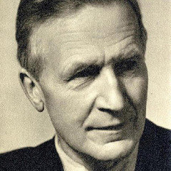
It is not known whether Paul Renner studied Albers’ stencil letters, but he may have taken notice of the special Bauhaus edition of Offset in 1926, which included the lettering of Bayer, Schmidt and Albers. In 1929 Futura Black was first cast. It is an unusual design in Renner’s Futura family as it is not a stencil-version of any of the other weights, but a design of its own; taking on the idea of divided shapes as seen in Schablonenschrift. However, Renners design is much more sophisticated and simpler, and perhaps Christopher Burke rightfully points out that it may have been developed from classic Fat Face display types to some extent. 5

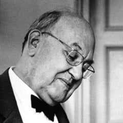
While Schablonenschrift only remained an idea, Futura Black was available as foundry type and quickly spread with the help of Bauer’s marketing. In 1931 it was used on the cover of the infamous typography and printing annual Klimschs Jahrbuch. Just as much as geometric grotesques, their stencil sisters became a popular style in the late 1920s and early 1930s with several similar designs available. Among them are Walter Cyliax’s Europa (1929) and Jan Tschichold’s Transito (1931). In 1933, Maximilian Debus, who was a teacher at Johannes Itten’s private art school in Berlin, published a series of lettering instructions – his take on the stencil style was Papierschrift (Papier, German for paper). Debus argues: “While it can be drawn, it may be a joy to construct stencils.” 6 His explanation of how to make stencils from cardboard lends the alphabet its name.

Albers eventually reworked his design in 1931: reduced to less shapes he developed the so-called Kombinationsschrift, that was produced as pieces made from glass by Metallglas AG in Offenburg/Baden, Germany, to be used in shop windows. In 1943 the German Institute for Standardisation even issued instructions for stencil lettering Schablonenschrift A as part of their DIN 1451, which follows a similar approach as the designs by Albers, Renner and Tschichold. A digital version of Albers’ Schablonenschrift, designed in a manner true to the original, is available from David Quay and Freda Sack of The Foundry as Architype Konstrukt (2011).


[link not found]
The stencil style composed of divided shapes further paved the way for new designs that imitated the stencil look, but did not actually derive from that technique. Two of the best-known stencil designs are extremely close in appearance as one of them reached the market shortly after the other in 1937 and both feature the same rather generic name: R. Hunter Middleton’s Stencil for Ludlow – which appears to have been released a bit earlier – and Gerry Powel’s Stencil™ for ATF – which has many digital imitations and seems to be known a bit better. Both are all-caps faces, just like Milton Glaser’s famous Glaser Stencil, designed in 1970. Reminiscent of popular modernist typefaces, Glaser Stencil is perhaps known for being featured in the iconic “FHD” identity of the University of Applied Sciences Düsseldorf (Fachhochschule Düsseldorf) that lasted for over 35 years – designed by Helmut Schmidt-Rhen.


True to the idea of caps-only is Christian Schwart’s FF Oxide Stencil, released in 2005. When Schwartz was a student at Carnegie Mellon University in Pittsburgh, he worked at a clothing company on 5608 Walnut Street. Inspired by stencil designs on the store’s shirts, Schwartz purchased old stencils at a hardware store and digitized the letters. What was then known as “5608” later turned into FF Oxide Stencil.

[link not found] [link not found] [link not found]
In recent years stencil alphabets have experienced yet another revival. While the exhibition of Kindel and Smeijers aimed at displaying artefacts that document historic examples of stencil letters, they also introduced a new series of stencil typefaces – each has a different background story – that were released with Smeijer’s type foundry OurType: the Stencil Font Series. As part of the series, Pierre Pané-Farré designed Orly Stencil, a face that is rooted in the manufacture of stencils from thicker paper, cardboard or film using very simple tools such as knifes and scissors. As a result the letters look rather simple without much complexity in the curves and less precision, lending Orly Stencil a clumsy and yet a very pleasant and likable look. Based on traditional humanist minuscule strokes, drawn with a broad-nib pen, Maurice Göldner designed so-called Standing Type, a more decorative, but very experimental approach to stencils. Fred Smeijers himself contributed Puncho (among others), inspired by extremely small stencil letter punches produced by S. M. Spencer from Boston. While Spencer would cut such letters at only 3 mm cap-height, the result is limited to some extent and features simple sturdy letter shapes. The series includes many more contributions and can be found here.
[link not found]
Expanding an existing type family with a stencil weight became a frequent move for type designers. Achaz Reuss is quite familiar with this process, he has designed stencil weights für URW’s Eurostile, Caslon, Beton and Cooper – all of them historic faces. As part of URW’s super family URW Serifa, a stencil version was also added to this popular typeface by Adrian Frutiger. While there may not be stencil additions to popular faces such as The Sans, FF Good® or FF Kievit® (all of them well-built), an attempt has been made to add one to FF Unit Slab® – only just when it was released. Included in the introduction specimen in 2009, graphic designer Alexander Roth designed a stencil showing for Erik Spiekermann’s new slab serif. This remained merely a marketing gag, while in the meantime Spiekermann and Ralph du Carrois designed a stencil weight of FF Unit® for the San Francisco Exploratorium – lending it the name Explo.
 created this iconic showing of a stencil ruler for the release of *FF Unit Slab®* (included in the [introduction specimen] (http://www.fontblog.de/wp-content/uploads/ff_unit_slab_schriftmuster.pdf)), arousing the curiosity of many typographers – including that of the author. The image was re-published in Johannes Erler’s Spiekermann-monograph [Hello I am Erik](http://shop.gestalten.com/hello-erik.html) in 2013, however, a stencil weight of *FF Unit Slab* remains unreleased. Hope dies last …](https://lg-assets.myfonts.com/fs/uploads/content_image/attachment/308913/mini_magick20160310-7130-1xz2nlf.jpg)

 designed an all-caps stencil version of *FF Unit®* for the [San Francisco Exploratorium](http://www.exploratorium.edu/) in 2012 known as *Explo*. While the digital font is not available, *Explo* was used for a lettering job with real stencils at the Suhrkamp Space in Berlin, designed by Ferdinand Ulrich with [p98a](http://p98a.com/). (Photographs by [Norman Posselt](http://www.decent.photography/albums/))](https://lg-assets.myfonts.com/fs/uploads/content_image/attachment/308915/mini_magick20160310-7130-ksty0l.jpg)
A well-built family that introduces another stencil companion this year is Ole Søndergaard’s FF Signa Super Family. Equipped with a three-year working grant from the Danish Arts Foundation in 1999, Søndergaard began to develop a typeface rooted in signage alphabets and architectural lettering. With the help of Flemming Rinds and Morten Olsen, FF Signa™ was born from this project and initially released with FontFont in 2000. Over the years Søndergaard gradually shaped a growing family, adding condensed and extended widths to FF Signa™ as well as FF Signa Correspondence™ in 2002 and FF Signa Serif™ in 2005. In 2011 FontFont released corresponding stencil weights for the sans and serif respectively.


Søndergaard’s latest major addition to the family was FF Signa Slab™, in 2012. And in keeping with the coherent visual system, the slab branch was equipped with a stencil style of its own lately. While FF Signa Stencil™ and FF Signa Serif Stencil™ consist of only three weights each (book, bold, black), FF Signa Slab Stencil features seven weights, ranging from extra light to extra black. With much stronger and accentuated serifs as opposed to FF Signa Stencil™, the slab stencil companion cuts a much finer figure in the light weights. Altogether the Signa family results in a consistent and well-equipped type system ready for identities, magazines and on-screen applications. Three convincing stencil packages also resume to the type’s vernacular lettering past – truly in the tradition of stencils.


Footnotes
1. See between writing and type: The stencil letter by Eric Kindel, published on
catapult.be [last viewed 21 Feb. 2016]
2. Ibid.
3. Unfortunately, the English language lacks a proper translation for the word Schrift, that functions as parenthesis for both type and lettering. It describes the bigger picture and includes almost everything that has to do with letters.
4. Hans M. Wingler: Das Bauhaus. Weimar, Dessau, Berlin und die Nachfolge in Chicago since 1937, Köln 2005, p. 427
5. Christopher Burke: Paul Renner. The art of typography, New York 1998, p. 107
6. Maximilian Debus: Technik der Schriftgestaltung. Eine Anleitung für die Praxis, Eberswalde 1933, p. 16
Trademark attribution notice
Signa und Oxide are trademarks of Monotype GmbH and may be registered in certain jurisdictions. FontFont and Unit are trademarks of Monotype GmbH registered in the U.S. Patent and Trademark Office and may be registered in certain other jurisdictions. All other trademarks and copyrights are the property of their respective owners.


