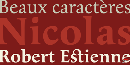
About Apolline Std Font Family
A Venetian serif in 6 styles
The Apolline typeface family was created by Jean François Porchez as a means to study the transition from Renaissance writing into the first printing types. Rather than sticking to the method commonly used these days for the creation of revivals of Jenson or Bembo types, it seemed more interesting to try and get in the same mindset as those exceptional designers during this pivotal period in the history of typography. Thus Apolline is an exploration of the design methods used by people like Nicolas Jenson and his contemporaries for adapting handwriting with its multiple occurrences (a, a, a, b, b, b…) into single, unique signs (a, b…).
Initially Jean François made drawings modelled after his own calligraphy. They were done at a very small size on tracing paper (2 cm high for the capitals) to preserve the irregularity of human handwriting. Besides emphasising the horizontal parts of the letter forms, the serifs were designed asymmetrically to reinforce the rhythm of the writing. The final drawings were produced at a large size (10 cm high for the capitals) to allow for subtle optimisation of specific details.
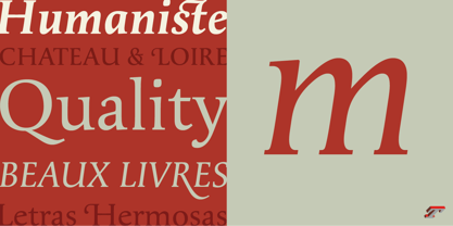
The very narrow and fluid Apolline italic
Influenced by various concepts for an ideal italic by Van Krimpen, Gill, etc. Apolline italic was designed at 8° degrees. Although the structure of the letterforms were informed by chancery scripts, the italic has full serifs like the roman. Very narrow and fluid, its unique design creates a good contrast when used in combination with its upright counterparts. Thanks to the presence of the serifs similar to roman typefaces it sets very neatly in large sizes.
The next step was digitising the drawings with Ikarus (the pre-Bézier-curves era) to create the final roman and italic fonts. Two years later, when the family was expanded to six series the same method was used, this time with Fontographer. This was necessary for correcting a few problems caused by the conversion to Bézier outlines, and to add intermediate weights. Before the advent of feature-rich OpenType, quality type families consisted of several separate fonts for each weight to provide users with various sets of numerals, an extended ligature set and alternates, ornaments, and so on.
Introducing Apolline
Morisawa Awards 1993
Apolline® Std
is a registered trademark of Typofonderie.
About Typofonderie
Founded in 1994 by Jean-François Porchez, Typofonderie is an independent digital type foundry in France, designing, manufacturing and distributing a selection of high quality typefaces for adventurous digital typographers. This is the first place in the world to buy our digital fonts.
Based in Clamart (France) from the end of 2008, Typofonderie as foundry, is dedicated to the distribution of a selection of high quality typeface designs, while ZeCraft focuses on the bespoke typefaces and lettering projects.
Many of the Typofonderie typefaces have won prizes in international competitions.
Read more
Read less