Select this license type when you are developing an app for iOS, Android, or Windows Phone, and you will be embedding the font file in your mobile application's code.
Chalfont
by Alan Meeks
Individual Styles from $45.00
Complete family of 7 fonts: $250.00

Chalfont Font Family was
designed by
Alan Meeks and
published by
Alan Meeks. Chalfont contains
7
styles and family package options.
More about this family
- Aa Glyphs
-
Best ValueFamily Packages
- Individual Styles
- Tech Specs
- Licensing
Per style:
$35.71
Pack of 7 styles:
$250.00
About Chalfont Font Family
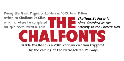
The typeface was designed after seeing a photocopy of some News Gothic text where the ink had faded on the bottom of each character. As character recognition is generally based on the top half of a character, readability was never compromised. Rather like Antique Olive the characters have a top heavy look when viewed straight on, however, as most type is read at an angle with the top further away than the bottom this top heavy look is diminished.
Designers: Alan Meeks
Publisher: Alan Meeks
Foundry: Alan Meeks
Design Owner: Alan Meeks
MyFonts debut: Jul 16, 2015
Chalfont
About Alan Meeks
A trained lettering artist and a craftsman who used to make letter shapes strictly by hand, Alan Meeks could be considered a bit of a dinosaur – but only because designers like him are a truly rare find. “I stayed at my first design studio for five years,” he said in his Creative Characters interview. “Obviously, drawing and cutting typefaces all day led to me developing typefaces of my own. My first font design was called Virgin Roman, appropriately enough, which is still around somewhere. In 1974 I joined Letraset.” At Letraset, he helped to build a huge type library designed for dry transfer sheets, a democratic pre-personal-computer system that allowed everyone to set display type by rubbing single letters onto paper. “Up to that point all the new designs were sourced from submissions from all over the world,” he said. “Aside from a few exceptions, the quality was generally inferior and although often original, not really typographically sound enough. So we set out to produce the kind of fonts we felt the market needed, seeking and commissioning fonts from established designers.” His contributions to Letraset’s pre-digital typeface collection was substantial, and many of his typefaces got a second life as part of the ITC, Letraset and Linotype digital libraries. His body of work for the company shows tremendous variety in a wide breadth of styles. “The variety of my designs came from necessity. In my early days at Letraset there were relatively few designs available compared to today, so my job was to create a library of designs and styles, to fill as many gaps in style as possible and to create trends as well as follow them.” His lettering talent extends beyond the limits of type design; his work in branding and packaging proves that. “Whilst I love creating new letterforms and building up a new design in words (I always work in words initially and look at crafting individual letters later) once the basic alphabet and numerals are done, producing the 80 or so incidental characters is tedious and then going through five other weights, italics and condensing can become mind-numbing. The beauty of logos and packaging is that you can see the final result in days or weeks whereas a finished font family can take over a year.”
Read more
Read less
- Choosing a selection results in a full page refresh.