Select this license type when you are developing an app for iOS, Android, or Windows Phone, and you will be embedding the font file in your mobile application's code.
Garibaldi™
by Harbor Type
Individual Styles from $0.00
Complete family of 8 fonts: $200.00

Garibaldi Font Family was
designed by
Henrique Beier and
published by
Harbor Type. Garibaldi contains
8
styles and family package options.
More about this family
- Aa Glyphs
-
Best ValueFamily Packages
- Individual Styles
- Tech Specs
- Licensing
Per style:
$25.00
Pack of 8 styles:
$200.00
Garibaldi Basic
4 fontsPer style:
$37.50
Pack of 4 styles:
$150.00
About Garibaldi Font Family
🏆 Selected for Tipos Latinos 6.
🏆 Selected for the 12th Biennial of Brazilian Graphic Design.
🏆 Typographica Favorite Typefaces of 2015.
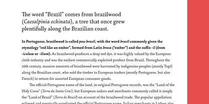
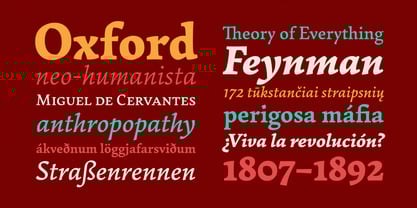
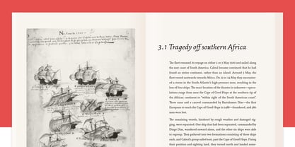
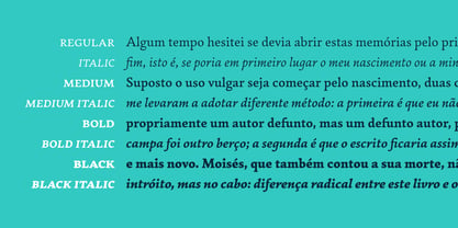
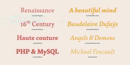
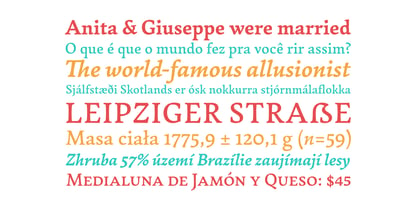
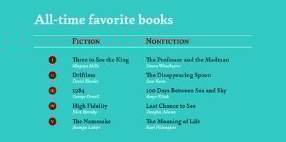
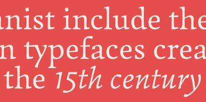
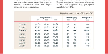
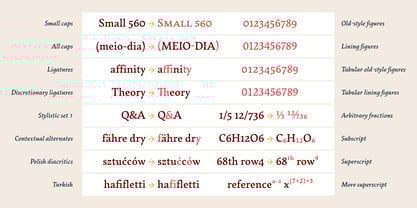
Garibaldi is a text typeface based on humanist calligraphy. It has an organic look and feel, while preserves the traditional construction of roman typography. It all started with a desire to learn more about the origin of the strokes on humanist typefaces. To accomplish that, Garibaldi features a 20° axis, medium contrast based on translation and expansion, asymmetric serifs, and terminals related to the broad nib stroke. Garibaldi Regular was nominated for Tipos Latinos 2014. Since then, the family was expanded with more weights and matching italics, making it a solid choice for setting books, magazines and documents. Among many OpenType features, each font contains small caps, ligatures and contextual alternates, totalling more than 750 glyphs and supporting at least 80 languages.
Designers: Henrique Beier
Publisher: Harbor Type
Foundry: Harbor Type
Design Owner: Harbor Type
MyFonts debut: Jun 12, 2015
Garibaldi™
About Harbor Type
Harbor Type is an independent type foundry based in the city of Porto Alegre, Brazil. It is run by Henrique Beier, graphic designer by major, type designer by heart. I develop typefaces for retail and provide font production services to other foundries and type designers. The foundry was started in 2014 with the release of Densia Sans. First available on a pay-what-you-want basis, it was well received by the public and inspired me to pursue designing typefaces for a living. Later on came Graviola, Garibaldi, Malva and others. Along the way I learned that fonts are more than just nice letterforms. They stand at the crossroads of design and technology, which is why I also pay special attention to the technical aspects of typography.
Read more
Read less
- Choosing a selection results in a full page refresh.