Select this license type when you are developing an app for iOS, Android, or Windows Phone, and you will be embedding the font file in your mobile application's code.
LaFarge
by Typetanic Fonts
Individual Styles from $14.00
Complete family of 15 fonts: $209.00


LaFarge Font Family was
designed by
Gregory Shutters and
published by
Typetanic Fonts. LaFarge contains
15
styles and family package options.
More about this family
- Aa Glyphs
-
Best ValueFamily Packages
- Individual Styles
- Tech Specs
- Licensing
About LaFarge Font Family
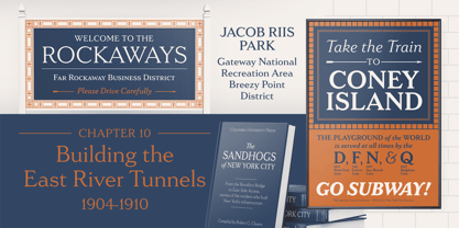
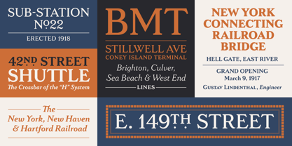
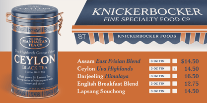
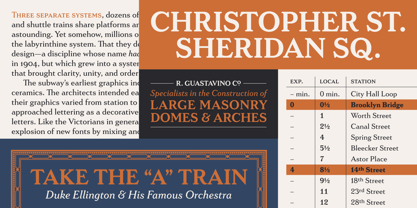
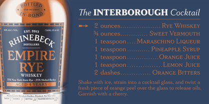
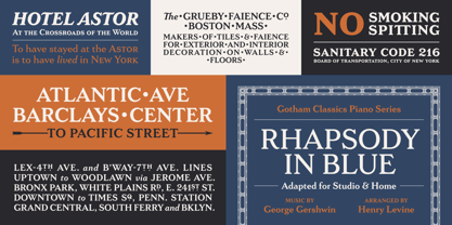
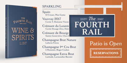
LaFarge is a typeface primarily inspired by the historic mosaic titling capitals found in the New York City Subway, designed by architect Squire J. Vickers and his staff between 1915-1927. These elegant but industrial signs are characteristic of early-20th century American architectural lettering, and show an evolution of the classical Roman capitals to lower contrast, bolder serifs, and more regular character widths. The majority of this lettering still remains in subway stations today, and though elements of the style vary from sign to sign, many carry the unique features that are reflected in LaFarge: high-waisted crossbars with angled serifs, elegantly curved “R” leg, and distinctive trapezoidal serifs. LaFarge expands this style into a lower case, taking cues from contemporary typefaces like Bookman, Cheltenham, and Della Robbia.
A number of typographic features are included, such as small caps, ordinal indicators / superscript letters, arrows, and a set of borders inspired by early subway tile. The result is a fashionable, architecturally-minded typeface that is just as at home on the façade of a grand public building as it is on packaging, magazines, or the web. LaFarge works well in both text and display settings, remaining readable at small sizes but showing off its elegant details in larger uses.
LaFarge has received the Communication Arts Typography Award, the ADC Annual Merit Award, is included in the 2020 STA 100, and was part of designer Greg Shutters’ winning portfolio in the 2019 Type Directors Club Ascender Awards. You can download a PDF specimen of LaFarge, and also view a video of LaFarge in action.
Designers: Gregory Shutters
Publisher: Typetanic Fonts
Foundry: Typetanic Fonts
Design Owner: Typetanic Fonts
MyFonts debut: Sep 24, 2021
LaFarge
About Typetanic Fonts
Greg Shutters is a Chicago-based designer specializing in type and lettering and began releasing commercial typefaces under the Typetanic Fonts label in 2013. Greg has a certificate in typeface design from the “Type@Cooper” extended program at The Cooper Union, and his typefaces have won numerous awards from The One Club / ADC, the Society of Typographic Arts (STA 100), Communication Arts, and Type Directors Club. Type Directors Club also named Greg as one of their “Ascenders” in 2019, which recognizes the work of designers under 35 years of age who show remarkable achievement in typography, type design, and lettering.
Read more
Read less
- Choosing a selection results in a full page refresh.