Select this license type when you are developing an app for iOS, Android, or Windows Phone, and you will be embedding the font file in your mobile application's code.
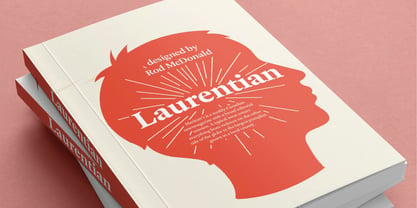
Laurentian™
by Monotype
Individual Styles from $29.00
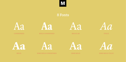
Complete family of 8 fonts: $179.99

Laurentian Font Family was
designed by
Rod McDonald and
published by
Monotype. Laurentian contains
8
styles and family package options.
More about this family
- Aa Glyphs
-
Best ValueFamily Packages
- Individual Styles
- Tech Specs
- Licensing
Per style:
$22.49
Pack of 8 styles:
$179.99
Laurentian Volume
5 fontsPer style:
$25.19
Pack of 5 styles:
$125.99
Laurentian Volume
5 fontsPer style:
$25.19
Pack of 5 styles:
$125.99
Laurentian Volume
5 fontsPer style:
$25.19
Pack of 5 styles:
$125.99
Laurentian Condensed Volume
3 fontsPer style:
$20.99
Pack of 3 styles:
$62.99
About Laurentian Font Family
Maclean's is a weekly Canadian newsmagazine with a broad editorial mission. A typical issue covers everything from violence on the other side of the globe to the largest pumpkin grown in a local county.
In 2001, Maclean's invited Rod McDonald to become part of the design team to renovate" the 96-year-old publication. The magazine wanted to offer its readers a typographic voice that was professional, clean, and easy to read. Above all, the typeface had to be able to speak about the hundreds of unrelated subjects addressed in each issue while remaining believable and uncontrived.
A tall order, perhaps? Now add in that this would be the first text typeface ever commissioned by a Canadian magazine. McDonald, who some have called Canada's unofficial "typographer laureate," took on the challenge.
McDonald used two historic models as the basis for Laurentian's design: the work of French type designer Claude Garamond, and that of the English printer and type founder, William Caslon. From Garamond Laurentian acquired its humanist axis, crisp serifs and terminals that mimic pen strokes. Caslon's letters are less humanistic, with a more marked contrast in stroke weight and serifs that appear constructed rather than drawn. These traits also made their mark on Laurentian.
Using these two designs as a foundation, McDonald drew Laurentian with the narrow text columns and small type sizes of magazine composition in mind. He gave his letters strong vertical strokes and sturdy serifs, a robust x-height and a slightly compressed character width
A tall order, per McDonald's genius is evident in the face's legibility, quiet liveliness and in the openness of the letters. The result is a typeface that not only met Maclean's demanding design brief, but also provides exceptional service in a wide variety of other applications.
Laurentian is available in three weights of Regular, Semi Bold and Bold, with complementary italics for the Regular and Semi Bold, and a suite of titling caps."
Designers: Rod McDonald
Publisher: Monotype
Foundry: Monotype
Design Owner: Monotype
MyFonts debut: Oct 13, 2005
Laurentian™
is a trademark of Monotype Imaging Inc. and may be registered in certain jurisdictions.
About Monotype
The Monotype Library is one of the world’s largest and most comprehensive collection of typefaces, featuring original designs of historical importance and a fresh range of contemporary and fashionable fonts. The Monotype Library includes thousands of timeless classics, hand-crafted revivals and original designs from many of the most innovative type designers and foundries in history. This distinctive, award-winning library of premium fonts provides brands and designers with a broad and reliable selection of typefaces for expressive typography in print and on screen. The Premium Foundry page can be viewed Here.
Read more
Read less
- Choosing a selection results in a full page refresh.