https://cms-prod.monotype.com/sites/default/files/styles/top_hat_banner_1000_124_/public/2023-08/FontShop%20Site%20Consolidation%20Top%20Hat_194.png?itok=ymc9wH63
Please update your browser. Why?

Zemestro

Designed by Dave Farey in 2003. Published by Monotype.

Starts at $29.99 for a single style and is available for:
Type to compare other characters
&
Book
&
Regular
&
Medium
&
Bold
&
120
Bei jedem klugen Wort von Sokrates ruft Xanthippe zynisch: Quatsch! Dabei grüßt die Quellnixe freundlich am Bach. Verflixt öde …
70
Bei jedem klugen Wort von Sokrates ruft Xanthippe zynisch: Quatsch! Dabei grüßt die Quellnixe freundlich am Bach. Verflixt öde …
40
Bei jedem klugen Wort von Sokrates ruft Xanthippe zynisch: Quatsch! Dabei grüßt die Quellnixe freundlich am Bach. Verflixt öde …
25
Bei jedem klugen Wort von Sokrates ruft Xanthippe zynisch: Quatsch! Dabei grüßt die Quellnixe freundlich am Bach. Verflixt öde …
18
Bei jedem klugen Wort von Sokrates ruft Xanthippe zynisch: Quatsch! Dabei grüßt die Quellnixe freundlich am Bach. Verflixt öde …
12
Bei jedem klugen Wort von Sokrates ruft Xanthippe zynisch: Quatsch! Dabei grüßt die Quellnixe freundlich am Bach. Verflixt öde …

Zemestro supports up to 81 different languages such as Spanish, English, Portuguese, German, French, Turkish, Italian, Polish, Kurdish (Latin), Romanian, Dutch, Hungarian, Kazakh (Latin), Czech, Serbian (Latin), Swedish, Belarusian (Latin), Croatian, Slovak, Finnish, Danish, Lithuanian, Latvian, Slovenian, Irish, Estonian, Basque, Icelandic, and Luxembourgian in Latin and other scripts.

Please note that not all languages are available for all formats.

View all 81 languages

Ramée
Três Cervejeiros
Vasco Núñez
Boquébière
Gæðingur
Stößche

Languages

Please select a product:

Supports 50 different languages:

  • A
  • Afar
  • Afrikaans
  • Albanian
  • Asturian
  • B
  • Basque
  • Breton
  • C
  • Catalan
  • Cornish
  • Corsican
  • D
  • Danish
  • Dutch
  • E
  • English
  • F
  • Faroese
  • Fijian
  • Finnish
  • French
  • Frisian
  • Friulian
  • G
  • Gaelic (Scottish)
  • Galician
  • German
  • I
  • Icelandic
  • Indonesian
  • Irish
  • Italian
  • K
  • Kinyarwanda (Ruanda)
  • Kirundi (Rundi)
  • L
  • Ladin
  • Luxembourgian
  • M
  • Malay (Latin)
  • N
  • Norwegian
  • O
  • Occitan
  • Oromo (Afan, Galla)
  • P
  • Papiamentu
  • Portuguese
  • Q
  • Quechua
  • R
  • Rhaeto-Romance
  • S
  • Sardinian
  • Shona
  • Somali
  • Spanish
  • Swahili (Kiswahili)
  • Swedish
  • T
  • Tagalog
  • Tsonga
  • Tswana
  • U
  • Uighur
  • W
  • Walloon
  • X
  • Xhosa
  • Z
  • Zulu
The
Black
Phlegmatics
Fractions
| 1/2
| 1/2
Tabular Figures
| 167
| 167
Proportional Figures
| 167
| 167
Superscript
| 123
| 123
Replaces character with superscript version.
Standard Ligatures
| flfi
| flfi
Replaces a sequence of glyphs with a ligature. Active by default.
Ordinals
| 1a2o
| 1a2o
Replaces characters with ordinal forms for use after figures.
View this style in detail
It’s through mistakes that you actually can grow. You have to get bad in order to get good.
— Paula Scher
View this style in detail
Punctuation
!
"
#
%
&
'
(
)
*
,
-
.
/
:
;
?
@
[
\
]
^
_
`
{
}
¡
§
¨
¯
´
·
¸
¿
Uppercase
A
B
C
D
E
F
G
H
I
J
K
L
M
N
O
P
Q
R
S
T
U
V
W
X
Y
Z
Lowercase
a
b
c
d
e
f
g
h
i
j
k
l
m
n
o
p
q
r
s
t
u
v
w
x
y
z
Modifiers
ˆ
ˇ
ˉ
˘
˙
˚
˛
˜
˝
Ligatures
Currency
$
¢
£
¤
¥
Symbols
+
<
=
>
|
~
¬
±
×
÷
Decimal
0
1
2
3
4
5
6
7
8
9
Other
²
³
¹
¼
½
¾
Mathematical Operators
Superscripts and Subscripts
Number Forms
Miscellaneous
¦
©
®
°
Letterlike
Geometric Shapes
Lowercase
µ
ß
à
á
â
ã
ä
å
æ
ç
è
é
ê
ë
ì
í
î
ï
ð
ñ
ò
ó
ô
õ
ö
ø
ù
ú
û
ü
ý
þ
ÿ
ā
ă
ą
ć
ĉ
ċ
č
ď
đ
ē
ĕ
ė
ę
ě
ĝ
ğ
ġ
ģ
ĥ
ħ
ĩ
ī
ĭ
į
ı
ij
ĵ
ķ
ĸ
ĺ
ļ
ľ
ŀ
ł
ń
ņ
ň
ʼn
ŋ
ō
ŏ
ő
œ
ŕ
ŗ
ř
ś
ŝ
ş
š
ţ
ť
ŧ
ũ
ū
ŭ
ů
ű
ų
ŵ
ŷ
ź
ż
ž
ƒ
ǽ
ǿ
ș
ț
Uppercase
À
Á
Â
Ã
Ä
Å
Æ
Ç
È
É
Ê
Ë
Ì
Í
Î
Ï
Ð
Ñ
Ò
Ó
Ô
Õ
Ö
Ø
Ù
Ú
Û
Ü
Ý
Þ
Ā
Ă
Ą
Ć
Ĉ
Ċ
Č
Ď
Đ
Ē
Ĕ
Ė
Ę
Ě
Ĝ
Ğ
Ġ
Ģ
Ĥ
Ħ
Ĩ
Ī
Ĭ
Į
İ
IJ
Ĵ
Ķ
Ĺ
Ļ
Ľ
Ŀ
Ł
Ń
Ņ
Ň
Ŋ
Ō
Ŏ
Ő
Œ
Ŕ
Ŗ
Ř
Ś
Ŝ
Ş
Š
Ţ
Ť
Ŧ
Ũ
Ū
Ŭ
Ů
Ű
Ų
Ŵ
Ŷ
Ÿ
Ź
Ż
Ž
Ǽ
Ǿ
Ș
Ț
Uppercase
Ω
Lowercase
μ
π
Other Private Use

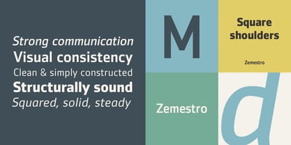
Zemestro is a straightforward design that is meant to be read. According to its designer, Dave Farey, "There's nothing calligraphic about it, and there are no defining or identifiable single characters -- it's just clean and simply constructed."Farey's goal was to create a more legible and friendlier typeface than those limited to single character and stroke widths. The face finds its foundation in two earlier designs from Farey: Cachet, a soft-terminal sans he drew in 1999, and a partial alphabet he created for the New Scientist, a British scientific journal. Cachet appears to be monospaced and constructed with geometrically precise character strokes, but it isn't. The characters drawn for New Scientific are more condensed and structured than Cachet. Their offspring Zemestro takes on the proportions of the New Scientific letters and builds them into a full typeface family. Round characters have squared shoulders, helping to create visually consistent letter spacing and even typographic color. Terminals are now square and clipped at right angles to the stroke.The Zemestro family is available in four weights, with complementary italics for the two lightest weights. Text copy in the Book weight is inviting and easy on the eyes, while the Regular is more imposing and authoritative. The Medium and Bold weights are excellent for providing emphasis in text copy and are also strong communicators at display sizes.The name Zemestro? "I'm always fascinated by typeface names," says Farey. "Most of mine are inspired by movies or books." It was while reading a book on the Russian revolution that Farey learned zemestro was the word for a village council or group of elders, "before Comrade Lenin dissolved them all," he explains. "So this is the first Zemestro since 1917. I thought it was worth reviving."

Zemestro has 6 Styles