Select this license type when you are developing an app for iOS, Android, or Windows Phone, and you will be embedding the font file in your mobile application's code.
Nawin Arabic Ltn
by Letterjuice
Individual Styles from $107.00
Complete family of 3 fonts: $290.00

Nawin Arabic Ltn Font Family was
designed by
Pilar Cano,
Ferran Milan and
published by
Letterjuice. Nawin Arabic Ltn contains
3
styles and family package options.
More about this family
- Aa Glyphs
-
Best ValueFamily Packages
- Individual Styles
- Tech Specs
- Licensing
Per style:
$96.66
Pack of 3 styles:
$290.00
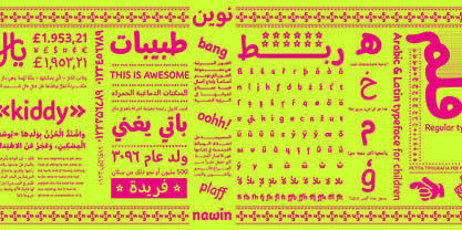
About Nawin Arabic Ltn Font Family
Nawin is an informal Arabic typeface inspired by handwriting. The idea behind this design is to create a type family attractive and ownable for children but at the same time a design that keeps excellent letter recognition for reading. Handwriting has been a great source of inspiration in this particular typeface. By emulating the movements of the pen, we have obtained letter shapes that express spontaneity. A bright group of letters create a lively and beautiful paragraph of text.
To get closer to handwriting and the variety of letter shapes that we draw while writing, this typeface offers a large number of alternative characters, which differ slightly from the default ones. Because we have programed the «Contextual Alternate» feature in the fonts, these alternate characters appear automatically as you set a text on your computer.
For instance, in the Arabic variability on vertical proportions between letters Alef and initial Lam, create movement in text and avoid the cold mechanical feel of repetition. In the case of the Latin a part from having an entire alternate basic alphabet, there are also different letterforms for characters with diacritics, this way variability becomes even greater. Nawin is quirky and elegant at the same time.
Letter recognition is relevant when reading continuous text. For this reason, in the Arabic, we have added another contextual alternate feature with alternate characters that help to avoid confusion when letters with similar or the same shape repeat inside one word. This is the case of medial «beh and Yeh» repeated three times continuously in the same word. The alternate characters change in shape and length, facilitating distinction to the reader.
Since this typeface is inspired by handwriting and the free movement of the hand while writing, we considered ligatures a good asset for this design. The Arabic has a wide range of ligatures that enhance movement and fluidity in text making look text alive, while the Latin achieves this same effect via contextual alternates.
Designers: Pilar Cano, Ferran Milan
Publisher: Letterjuice
Foundry: Letterjuice
Design Owner: Letterjuice
MyFonts debut: Oct 27, 2022
Nawin Arabic Ltn
About Letterjuice
We are a small foundry and type design studio experienced in many different fields surrounding type design, typography, visual communication and teaching. We specialise in letters in a broad sense, from type design to lettering, from Latin to Arabic, passing through other scripts such as Greek, Cyrillic, Hebrew and Thai. Our type library is a manifestation of our personal curiosity and our experimentation ground. We enjoy having room to explore our creativity within the boundaries of functionality, we hope you like what you see!
Read more
Read less
- Choosing a selection results in a full page refresh.