About PENROSE Geometric Font Family
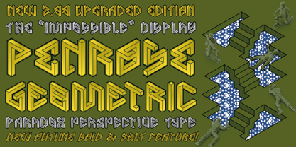
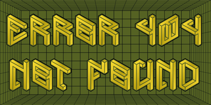
The 3D/4D Paradox Impossible Perspective Display Typeface! Created for defying the Impossible!
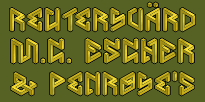
Penrose Geometric™ was inspired by the ‘Penrose Triangle’ or “Impossible Tribar” invented in 1934 by Swedish artist Oscar Reutersvärd, the father of “Impossible Figures” and a few others of his iconic and instigating impossible sculptures designs, denominated as “Japanese Perspective” as its related to traditional Japanese “isometric-like” drawings. It was profitable to explore this Type field as a revival of his work, while this genre was kind of rare in 2013 when it was first released…
Plus of course, an homage to the Dutch Master MC Escher, which deep labored this and other Impossible Perspective Paradoxes in a higher level, incorporated to unique architectonic designs, in addition to the brilliant mathematician Sir Roger Penrose and his father Lionel, who popularized this kind of Optical Illusions in 1950 and described it as “The impossibility in its purest form” in the famous British Psychology Journal article. Also, thanks to them, this typeface has earned its name!
The first version of this font was an Academic Work to present a Display Alphabet in Typography class in 2012, during studying Graphic Design in college, it was kind well appreciated and received an A+ Grade, then I was encouraged to make a Real Typeface, that came a bit ingenuously in 3 styles. It was my first font, published by the extinct MMC foundry registry which had a bad naming appropriation from Typodrome, previously the academic type-project from the institution mag.
*The Original or Pre-Version font-family that was first released 2013 is also still to be separately relaunched and be available again with a few fixes as soon as possible, titled as Beta Font… As only for public library storage and a more democratic licensing purpose.
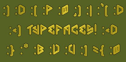
While comparing first family had only the uppercase set of characters repeated twice and far away inferior in overall properties, against 2 sets of both cases with alternates and much more glyph ranges and accuracy way beyond… Plus, plenty of font styles for layer typesetting. It also included card-suites.
The 2nd edition upgrade took place in 2018 and relaunched by MMC-TypEngine in 2021 at 2.99 improved edition with optical rescaled Size, in addition to new inedited ‘outline Bold’ styles to the font-family! Along with other fixes, as simplified contours which made a better Rendering quality.
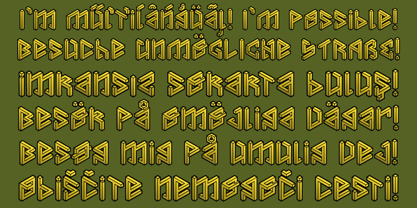
Tip: This current font-family version is a Mix-Case type. As so, typing as a normal text with lowercases along the sentences can look kind of “Funny”, for Titling design you may set all text to uppercase, or better Capitalize, then mix cases for instance, try further also to use the stylistic alternates feature same as the B styles to get a different look, and make greater impact!
— Notice that all the standard or default styles (meaning pro features) have 629 glyphs and the B styles has 364 glyphs or the main half portion.
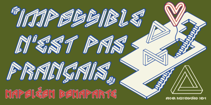
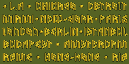
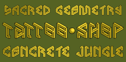
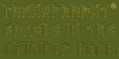
Usage-Suggestions: Penrose Geometric™ is quite appropriated for Logos and Titling Displays, Branding Projects, Posters, Web Page Headings, Publishing’s, Clothing and Printing design… Plus, of course Motion Graphics, Cartoons & Comics, Cards & Games… Everywhere surfaces that you can flat this Type of Illusion through exploring Geometric engaging with this “tricky” perspective Paradoxes that unanimously seems impossible to realize or to build even to the less skeptic...
Enjoy the Impossible Possibilities with Penrose Geometric! & Go beyond!
Greetings!
André, MMC-TypEngine.
PENROSE Geometric
About MMC-TypEngine
MMC-TypEngine | Multimedia Mastering & Creative Type-Systems. A New Type Foundry Post Est. in 2021, MMC started over its register from 2013 under new name detached from Typodrome, a separated Type-Brand. The Perpetual MMC-TypEngine puts its efforts to present Typefaces with Math or Puzzled emphasis in beyond of Geometry Fields, Urban Designs, Patterns, Rhythms, plus Freestyle Cool Fonts made with Love & High-End Criteria! Inspired by Underground Culture, Architecture and Engineering as well! As a curiosity, its ‘MMC’ was originally a Crew of Graffiti played as a “Many Meanings Challenge” Acronym, firstly called as the infamous Cartoon & Comics Portuguese Expression, “Macacos Me Mordam” as a Catchphrase that also reminisces the Type atmosphere. New Fonts coming Soon! Stay tuned!
Read more
Read less