Select this license type when you are developing an app for iOS, Android, or Windows Phone, and you will be embedding the font file in your mobile application's code.
Possible
by K-Type
Individual Styles from $20.00
Complete family of 10 fonts: $100.00

Possible Font Family was
designed by
Keith Bates and
published by
K-Type. Possible contains
10
styles and family package options.
More about this family
- Aa Glyphs
-
Best ValueFamily Packages
- Individual Styles
- Tech Specs
- Licensing
Per style:
$10.00
Pack of 10 styles:
$100.00
Possible Thin + Thin Italic
2 fontsPer style:
$10.00
Pack of 2 styles:
$20.00
Possible Regular + Italic
2 fontsPer style:
$10.00
Pack of 2 styles:
$20.00
Possible Medium + Medium Italic
2 fontsPer style:
$10.00
Pack of 2 styles:
$20.00
Possible Light + Light Italic
2 fontsPer style:
$10.00
Pack of 2 styles:
$20.00
Possible Bold + Bold Italic
2 fontsPer style:
$10.00
Pack of 2 styles:
$20.00
About Possible Font Family
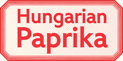
POSSIBLE is both sans and serif, either is possible. The typeface is a sans-serif impersonating a spur serif, or it’s a glyphic with the look and feel of a sans.
This clean, contemporary family is inspired by Percy J Smith’s ’Petit Serif’ from 1928, and similarly takes inspiration from Johnston’s Underground, though more recent influences provide geometric and humanist elements that, together with the tiny micro-serifs, improve clarity and legibility.
Spur serifs such as Petit Serif, Copperplate and Liberty are often caps-only fonts, but Possible contains a lowercase, as well as a full Latin Extended-A character set.
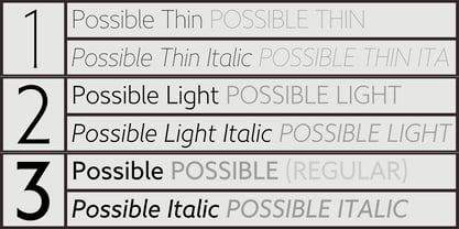
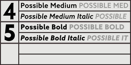
Possible is available in five weights – Thin, Light, Regular, Medium and Bold – each supplied with a corresponding, optically-corrected italic.
Designers: Keith Bates
Publisher: K-Type
Foundry: K-Type
Design Owner: K-Type
MyFonts debut: Jul 11, 2020
Possible

About K-Type
K-Type is a small, independent type foundry based in Manchester England, offering a unique range of high quality fonts which are modestly and simply priced for designers, small businesses and large organisations.In addition to creating new typefaces resulting from formal experimentation, many K-Type fonts show the influence of inspirational artists and designers, many exploring the mix of insular and eclectic that has forged the typographical landscape of Britain and America.K-Type is also keen to make affordable fonts from styles which possess cultural currency or an existing social presence, generally redrawn to include comprehensive character sets containing a full complement of Latin Extended-A glyphs. New, previously unavailable weights and italics are often designed and added.
Read more
Read less
- Choosing a selection results in a full page refresh.