About Quietism Variable Font Family
A smooth contemplative Antiqua with aspiring to the sky ascenders, inspired by the Quietism philosophy. Clarity of the mind is achieved by bringing the body into a state of calm and contemplation, and this is reflected in the design – the quiet horizontal serifs (body) are opposed to the peaky soaring ascenders (mind). The design also features four optical size subfamilies with different x-height and contrast, oldstyle diagonal stress, oldstyle figures by default, smooth details and slightly dark texture.
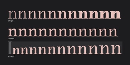
Variable axes: Weight, Contrast, X-Height.
Scripts: Latin, Greek, Cyrillic.
Languages: 480+. The complete list of supported languages: michaelrafailyk.com/quietism
Kerning: 4553 class-to-class pairs.
Hinting: Not applied.
Format: TTF – OpenType with TrueType outlines.
Variable Font: Quietism Variable provides more options than static versions, and has three axes: Weight (Thin–Black), Contrast (Low-High), and X-Height (Low-High). Variable fonts includes thousands of styles that you can access using a sliders on graphic editor or via CSS on web browser. Mixing different axes gives you extra styles not represented by static fonts.
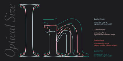
Optical Size: The typeface is represented by four subfamilies: Text (low contrast, high x-height – for paragraph 10-20 pt), Deck (medium contrast, medium x-height – for subheading 20+ pt), Display (high contrast, medium x-height – for heading 72+ pt), Poster (high contrast, low x-height – for big size 120+ pt).
Small Caps: Lowercase letters and Oldstyle Figures are replaced with Small Capitals forms.
Capitals to Small Caps: Uppercase letters, all figures, and some punctuation are replaced with Small Capitals forms.
Case Sensitive Forms: ()[]{}‹›«»-–—•·#%‰@ and Arrows are centered on capitals. Oldstyle figures are replaced with Lining figures.
Oldstyle Figures: 0123456789 #%‰. Designed to work with lowercase letters. Used by default.
Lining Figures: 0123456789 #%‰. Figures are the same height as uppercase letters (cap height).
Proportional Figures: Lining, Oldstyle, Small Caps, Capitals to Small Caps.
Tabular Figures: Lining, Oldstyle, Small Caps, Capitals to Small Caps.
Ordinals: adehnorst.
Superscript, Subscript, Numerator, Denominator: 0123456789.
Fractions: ¼½¾⅐⅑⅒⅓⅔⅕⅖⅗⅘⅙⅚⅛⅜⅝⅞⅟ (precomposed). Any other fractions (even those typed through a slash) will also be displayed correctly, with the automatic replacement to Numerator + fraction + Denominator.
Slashed Zero: All 0 figures.
Contextual Alternates: Number sign character (#) before uppercase letters is replaced by its version centered on capitals. Hyphen character (-) between two uppercase letters is replaced by its version centered on capitals. First of two TT letters is replaced by its alternate form. Letters vwy before the letters fijmnprtuvwxy are replaced with an alternate shorter versions that fits better in the context.
Contextual Alternates (Greek): ΆΈΉΊΌΎΏ. Greek uppercase accented characters lose their tonos accent and retain only dieresis in All Caps and Small Caps modes. Turned on by default. If you need tonos accents in All Caps then turn off Contextual Alternates (calt) feature.
Stylistic Alternates: FTГТИЦЩцщ and their versions with diacritical marks.
Stylistic Set 01 “Arrows”: Left <- Right -> Up <| Down |> Left Right <-> Up Down <|> North West <\ North East /> South East \> South West
Stylistic Set 02 “Round-Square Cyrillic”: ДИЙЍЛФвгджзийѝклнптцчшщьъю characters are replaced with its Bulgarian or Russian forms.
Stylistic Set 03 “Cyrillic Tse Shcha short tails”: ЦЩцщ characters are replaced with its alternate form with short tail.
Stylistic Set 04 “Cyrillic I full serifs”: ИЙЍӢ characters are replaced with its alternate form with inner serifs.
Stylistic Set 05 “FT bent inward serif”: FTГ characters and their versions with diacritical marks are replaced with its alternate form with right head serif that bent inside.
Stylistic Set 06 “Small Caps centered on Capitals”: Small Caps are vertically centered on uppercase letters.
Standard Ligatures: fi fl fb ff fh fj fk ffb ffh ffi ffj ffk ffl.
Discretionary Ligatures: Th ct st.
Localized Forms: 52 character substitutions for Azeri, Bulgarian, Catalan, Dutch, German, Kazakh, Macedonian, Moldavian, Polish, Romanian, Serbian, Tatar, Turkish.
Glyph Composition/Decomposition (Diacritics): Full Latin and based Vietnamese set of diacritics (571 characters). Precomposed.
Quietism Variable
About Michael Rafailyk
Michael Rafailyk is a Type Designer from Ukraine specialized on Latin, Greek, Cyrillic scripts. He like to take strange and unpopular ideas and make them usable. Thanks to many years of experience working with branding, Michael is well aware of the role typefaces play in the communication between the brand and the customer. At the same time, his experience in musical composition came in handy in the sense of rhythm and the overall visual harmony in the text.
Read more
Read less