Select this license type when you are developing an app for iOS, Android, or Windows Phone, and you will be embedding the font file in your mobile application's code.
Vertical
by Alias
Individual Styles from $60.00
Complete family of 5 fonts: $200.00

Vertical Font Family was
designed by
Gareth Hague and
published by
Alias. Vertical contains
5
styles and family package options.
More about this family
- Aa Glyphs
-
Best ValueFamily Packages
- Individual Styles
- Tech Specs
- Licensing
Per style:
$40.00
Pack of 5 styles:
$200.00
About Vertical Font Family
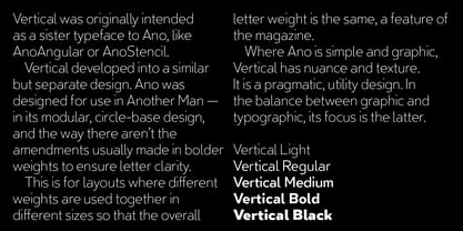
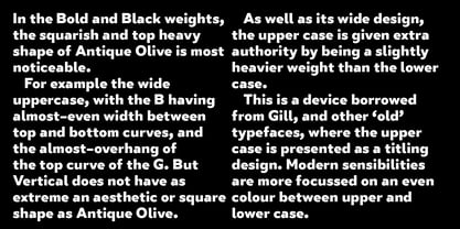
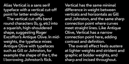
Alias Vertical is a sans serif typeface with a vertical cut-off point for letter endings. The vertical cut-offs bend round characters (b, c, o, etc) into a squarish, high-shouldered shape, suggesting Roger Excoffon’s Antique Olive. In mid-weights, the typeface mixes Antique Olive with typefaces such as Gill or Johnston, for example the shape of the t, the l borrowing Johnston’s flick. Vertical has the same minimal difference in weight between verticals and horizontals as Gill and Johnston, and the same sharp connection point where curves meet straight lines. Like Antique Olive, Vertical has a narrow connection point here, adding contrast and definition. The overall effect feels austere at lighter weights and strident and graphic at bolder weights, and sharp and incised throughout. In the Bold and Black weights, the squarish and top heavy shape of Antique Olive is most noticeable. For example the wide uppercase, with the B having almost-even width between top and bottom curves, and the almost-overhang of the top curve of the G. But Vertical does not have as extreme an aesthetic or square shape as Antique Olive. As well as its wide design, the upper case is given extra authority by being a slightly heavier weight than the lower case. This is a device borrowed from Gill, and other ‘old’ typefaces, where the upper case is presented as a titling design. Modern sensibilities are more focussed on an even colour between upper and lower case. Vertical was originally intended as a sister typeface to Ano, like AnoAngular or AnoStencil. Vertical developed into a similar but separate design. Ano was designed for use in Another Man — in its modular, circle-base design, and the way there aren’t the amendments usually made in bolder weights to ensure letter clarity. This is for layouts where different weights are used together in different sizes so that the overall letter weight is the same, a feature of the magazine. Where Ano is simple and graphic, Vertical has nuance and texture. It is a pragmatic, utility design. In the balance between graphic and typographic, its focus is the latter.
Designers: Gareth Hague
Publisher: Alias
Foundry: Alias
Design Owner: Alias
MyFonts debut: Mar 30, 2019
Vertical
About Alias
Alias was formed in 1996 by Gareth Hague and David James initially to develop into typefaces the bespoke lettering designs produced for their record cover and book projects. As well as typeface design, Alias has produced logotype designs for clients including Ghost, L.K.Bennett, MCQ, Jennifer Lopez for Kohl's, Lane Crawford, Calvin Klein Beauty fragrance and Prada Candy fragrance. For Prada Candy this included the development of the Prada logo into a full typeface. Typeface designs include headline typefaces for the 2012 Olympic Games and Sunday Times Magazine, and typeface and layout design for Another and Another Man magazines. Alias also works with design agencies and advertising agencies on typefaces for corporate clients and advertising campaigns. Graphic design includes music and arts related projects and book design for clients including Phaidon, Jake and Dinos Chapman and Tate Modern.
Read more
Read less
- Choosing a selection results in a full page refresh.