Select this license type when you are developing an app for iOS, Android, or Windows Phone, and you will be embedding the font file in your mobile application's code.
VLNL Thueringer™
by VetteLetters
Individual Styles from $30.00

VLNL Thueringer Font Family was
designed by
Jacques Le Bailly and
published by
VetteLetters. VLNL Thueringer contains
1
styles.
More about this family
About VLNL Thueringer Font Family
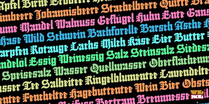
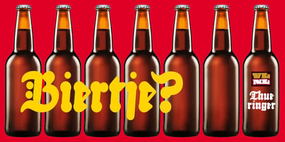
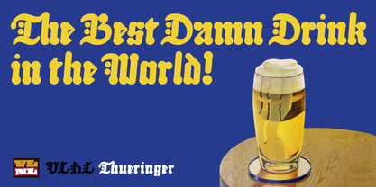
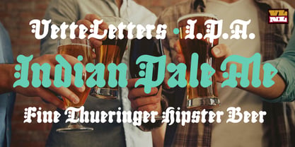
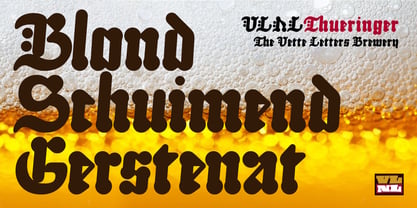
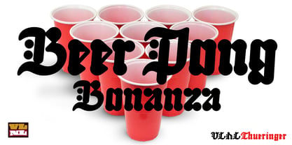
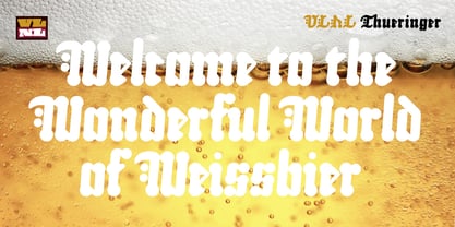
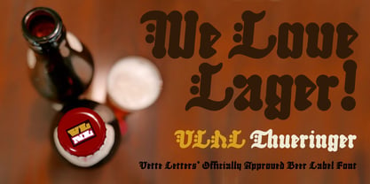
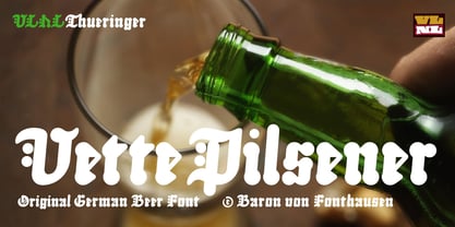
We cannot imagine anyone not liking beer. Especially on a warm summer night there is simply little that can top an ice cold brewski. And with the current wave of home-brewed ales and lagers, Vette Letters decided to not stay behind and brew its own brand. Just so we can design our own beer bottle label using our own font. VLNL Thueringer comes from the drawing board of Jacques Le Bailly (a.k.a. Baron von Fonthausen), the German-French specialist in the fields of both beer and type design. One day Jacques got inspired by Albrecht Dürers 15th century Fraktur (blackletter) alphabet, and decided to design a contemporary rounded version of it. Although the historic context is clearly visible, Thueringer definitely stands its own ground. It's a modern techno-style blackletter with a (beer)truckload of interesting design details. Thueringer contains a number of ligatures and an alternate set of numbers. Apart from the regular uses like logos, posters, flyers and headlines we definitely would like to see our Thueringer used on beer bottle labels and crates, but also cafés and hipster bars would do well with this modern-day blackletter. Hell, even wine or liquor labels, football team jerseys, Oktoberfest flyers, it's just too much to mention. As long as it is accompanied by a cold beer.
Designers: Jacques Le Bailly
Publisher: VetteLetters
Foundry: VetteLetters
Design Owner: VetteLetters
MyFonts debut: Dec 15, 2018
VLNL Thueringer™
is a trademark of VetteLetters.
About VetteLetters
VetteLetters.nl is fascinated by kebab shops, local chinese restaurants and fish-and-chips joints – not just the food but especially the shopfront typography. If all the other type foundries are like haute cuisine restaurants, then VetteLetters is the font-imbiss in the world of exclusive and expensive font foundries. VetteLetters, based in Amsterdam, loves food and loves fonts. So let’s introduce our chefs: After a wonderful career as a dishwasher, assistant cook, some kind of designer, and last but not least type designer, Donald® Roos is now one of VetteLetters CEOs. Donald DBXL Beekman is “the other Donald” and also the other CEO. DBXL produces as many typefases as Prince makes records. Jacques “Sardines” Le Bailly also known as the Baron von Fonthausen is Chief Type Tech. Dev. Dept. and we have Martin “TwoPoints” Lorenz, baking his fonts in the lovely climate of Barcelona. The latest addition to the VetteLetters stable is designer Henning Brehm aka “Design Tourist” hailing from Berlin.
Read more
Read less
- Choosing a selection results in a full page refresh.