Skip to content
MyFonts is the largest font marketplace in the world, offering professional fonts for any project.
Over 270,000 available fonts, and counting.
Album
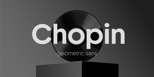
Chopin
by
Fontfabric
20
fonts starting at
$0.00
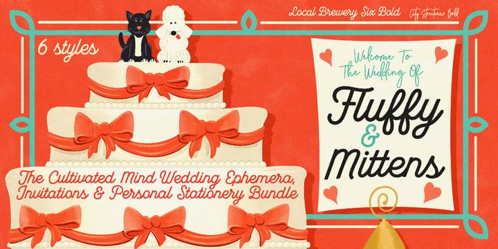
Cultivated Mind Bundle
by
Cultivated Mind
Bundle
6
fonts starting at
$30.00
Album
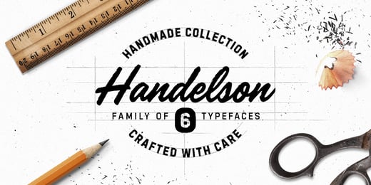
Handelson
by
Melvastype
6
fonts starting at
$29.00
Album
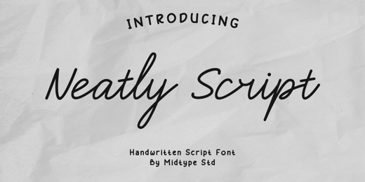
Neatly Script
by
Midtype
6
fonts starting at
$24.00
Grype Bundle
by
Grype
Bundle
5
fonts starting at
$39.00
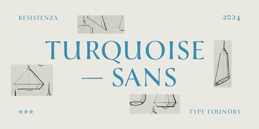
Album
Turquoise Sans
by
Resistenza
2
fonts starting at
$45.00
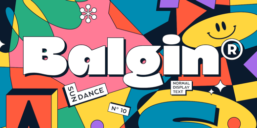
Album
Balgin
by
Studio Sun
2
fonts starting at
$12.00
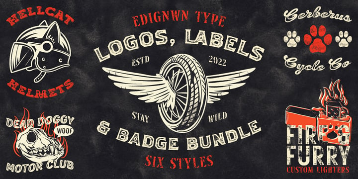
Martellas Stamp
by
Edignwn Type
Bundle
6
fonts starting at
$18.00
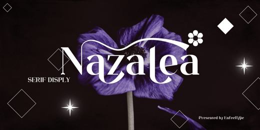
Album
Nazalea
by
Enfeeltype
18
fonts starting at
$17.00
Add to Album
New Album
Done
Back to Buying Choices
Printer-friendly version
×
Close
Choosing a selection results in a full page refresh.


 New Album
New Album
New Album