Discover legacy content from FontShop.com, preserved for your reference.
Mind the Gap
’s [Beloved Sans](/families/beloved) the kerning was deactivated in the top line. While for example the combination ‘AL’ looks perfectly fine with the regular spacing, the ‘AV’ pair displays an unsightly gap. The bottom line shows how the careful kerning by the designer moves the letters in problematic pairs closer together, thus eliminating excess space.](https://lg-assets.myfonts.com/fs/uploads/content_image/attachment/385141/mini_magick20160524-28972-1jdso6r.png)
While the majority of spacing issues in a typeface can be resolved by continuously fine-tuning the side bearings of the glyphs during the drawing process, there will always be exceptions you simply cannot get right. Due to their structure certain letters like the capitals ‘A’, ‘L’, ‘T’, ‘V’, ‘W’, ‘Y’ ‘trap’ space: they have large gaps on one or both sides. For example, by their nature, cap ‘L’ traps space in its upper right quadrant, and cap ‘T’ under both arms. Again, observing metal and wood type teaches us how a physical mass prevents the adjoining character to move any closer.
This can create unsightly holes when they are paired with specific other characters. Consider for example a capital ‘T’. There are no spacing problems if it is followed by an ‘h’: the top of the ascender reaches as high as the arm, so the side bearings on both characters ensure the distance between them is correct. However if it is followed by a character that fits under its arm, like an ‘o’, the space underneath the arm of the ‘T’ and above the ‘o’ visually connect to create one space that looks too big compared to the spaces between other letter pairs.
Correcting Space
Even since the days of metal and wood type, options have existed to compensate for this excess space. The part of a character that creates the spacing problem can be made to extend beyond the physical piece of lead the character sits on. This floating part is called a ‘kern’. Because there is no physical body obstructing it, the kern slides over the adjoining piece of lead, allowing the characters to come closer to each other than previously possible. This is where the term kerning originated.
The kerning process can only start once the typeface designer is completely done drawing and spacing. She needs to go through all the known problematic letter pairs to visually determine which ones need to be adjusted. The number depends largely on the drawing of the typeface in question, as some types of designs will cause more problematic pairs than others due to the construction of the characters. Fortunately reference documents exist that help with this process, for example Christoph Köberlin’s Kerningtest. And just like with spacing, letters with similar construction can be kerned in batches, which speeds up the kerning process. All the kerning pairs are saved into a kerning table that is built into the font file. The app or browser the font is used in reads and applies the kerning values. There is one caveat: if an app or browser doesn’t support kerning, the kerning values will not be applied to the fonts in that specific app or browser.
Personal Space
Similar to spacing, kerning is far from being an exact science with fixed rules and defined parameters. Typeface designers rely on their eye, their experience, and let personal taste play a role to a certain extent. Some kerning pairs are no-brainers, but others allow for a certain degree of leeway. To come back to the ‘To’ pair again, how far should the ‘o’ slide underneath the arm of the ‘T’? There is a lot of space that can be filled, but how much space underneath its arms does the capital need to keep its integrity as a letter ‘T’? I remember in the early 90s that the first digital versions of Monotype’s Gill Sans type family were excessively kerned. Ascenderless lowercase letters came so close to the stem of the ‘T’ or ‘Y’ that it felt really cramped. Also, if a sentence started with an ‘A’ the kerning on the left made the space between the capital and the preceding period all but disappear, and a second space character needed to be inserted to restore the normal distance.
Because personal taste plays a definite role, certain applications like Adobe InDesign or QuarkXpress give users control over kerning and spacing, allowing them to override the built-in values defined by the type designer. The important thing to remember is that any changes only affect the behaviour of fonts in that specific application, be it in one single document or in many. The actual fonts remain unchanged and their behaviour will not be altered in any other apps. Because I haven’t touched QuarkXpress since the very early 2000s I will focus on the Adobe CC apps. The Kerning dialog is located in the Character window.
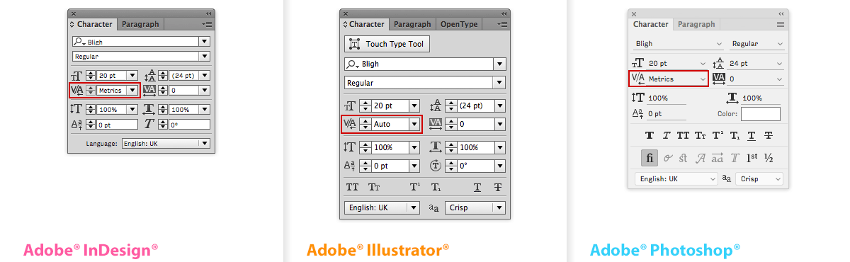
Metrics/Auto vs. Optical Kerning
There are different ways the kerning of fonts can be customised. The most straight-forward approach is on a character-by-character basis. When inserting the cursor between two characters in a pair the kerning value is displayed in its dedicated window. A number between parentheses designates an automated value (defined by either the typeface designer or the application); without parentheses it is a user-defined value. Simply change that number to adjust the kerning value. Adobe InDesign and QuarkXPress use different kerning values: 1/200 unit in QuarkXpress and 1/1000 unit in InDesign, which means the latter is five times more precise. They both offer shortcuts to speed up the kerning process and make it more intuitive. In InDesign on Apple Mac hold down the Option key and use the left or right arrow to respectively subtract or add space between two characters; holding down the Command key as well multiplies the steps by five. You can define the increments in Preferences > Units & Increments > Keyboard Increments.
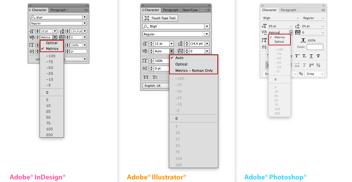
Manually kerning individual letter pairs is not desirable when wrangling lengthy documents. Both QuarkXPress and the Adobe CC applications allow document-level customisation. In QuarkXPress the user can set up custom kerning tables for fonts that are applied to either one single or multiple documents. The Adobe CC apps have two different settings for kerning: Metrics/Auto and Optical. The naming of the two settings is unfortunate – Metrics/Auto suggests a mechanical setting, while Optical suggests this is the visually preferable solution. However this is the exact opposite of what they actually are. The Metrics/Auto setting accesses the kerning tables as defined by the typeface designer, and should be the one used with professional fonts. When kerning is set to Optical the app will ignore the built-in kerning tables, mathematically evaluate the character shapes and autonomously rearrange both spacing and kerning according to those shapes. While this can be helpful when using amateur fonts that are poorly spaced and kerned, it ignores and messes up the careful spacing and kerning by professional type designers. Furthermore there are situations where the Optical setting produces horrendously bad spacing. One of them is layered chromatic type. As the character shapes can differ quite drastically in the different layers, the components of the letters don’t match up anymore. Another one is connected scripts. Because the Optical algorithm looks at the entire letter form it includes the connecting strokes, with disastrous results. The only instance where Optical might improve built-in spacing and kerning is for very large display type. When in doubt always use Metrics/Auto, which is the default setting.
But What About Tracking?
There is a lot of confusion regarding the difference between kerning and tracking. Kerning is removing or adding space between two individual characters. Tracking adds or removes spacing between several characters in a sequence. But this is the subject of the next post in this series.
Adventures in Space
- Part 1 – Adventures in Space: Spacing
- Part 2 – Adventures in Space: Kerning
- Part 2.5 – Adventures in Space: Special Cases
- Part 3 – Adventures in Space: Tracking
Header image by Paolo Gadler. Changeling Neo typeface by Mark Simonson.