Discover legacy content from FontShop.com, preserved for your reference.

One could argue you waited a long time before releasing your first commercial typeface.
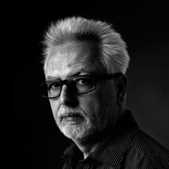
Aad van Dommelen | “You can consider me a late-bloomer when it comes to typeface design, despite my training at the Royal Academy of Arts, The Hague in the Netherlands (1975–1980) where I was a pupil of Gerrit Noordzij. Noordzij integrated the typeface design course into the regular Graphic and Typographic Design curriculum. His classes were an eye-opener for me, on many different levels. Every student had to design two typefaces for their graduation project – of course drawn by hand. My co-student and good friend Petr van Blokland was a pioneer in the field of computing. Back then he already created the now-famous visual of the contrast cube for Gerrit.”


FF Aad™ is your first commercial release, but it is not the first typeface you designed, is it?
Aad van Dommelen | “Already from early on many of my co-students, like the Letters] group, got intensively involved in typeface creation. I however ended up in the office environment during my internship and became immersed in corporate design. Nevertheless I art directed Henk van Leyden from Vorm Vijf in The Hague for the development of a corporate typeface for the Rotterdam transport company RET. I became creative director, first at Vorm Vijf, then at Proforma in Rotterdam, and from 1997 on at TotalDesign/Total Identity in Amsterdam. It is at Total Identity that I created my first complete typeface, the Oneliner, as a building block for our corporate identity. This was the catalyst that made TID decide to focus more actively on the development of corporate typefaces.”


“At Total Identity I created fonts for amongst others Hyundai Card Korea, MRO Industries, Stern, Daum Communications Korea, Viglilius Mountain Resort Italy and Heungkuk Insurance Korea. I eventually left Total Identity in 2008 to start my own studio Witvorm which specialises in corporate identity, corporate design, logo (re)design, (corporate) typefaces and typography. For Witvorm I have created fonts for amongst others Total Impact Seoul, SK Telecom Korea, JTBC TV Korea and LG (via Total Identity).”


The design of a corporate face is usually informed by the identity of the brand, the image of the company, the atmosphere and message that the typeface has to communicate. This is however not the case when creating your own design. How do you deal with this freedom?
Aad van Dommelen | “For each new typeface design you need a starting point, a unique approach. This is best achieved when you can identify a need for a typeface that doesn’t exist yet. This need usually arises when you start from a well-determined typographic application – be it the identity of an organisation or a specific usage. I consider having an extensive experience as a graphic designer definitely an advantage: while designing you often feel a particular style of typeface or typographic property is missing from what is available on the market. This is the reason why I opted for the applied arts at the KABK, exactly because I work best when given an assignment or a design problem to solve.”

Where did the basic idea for FF Aad come from?
Aad van Dommelen | “I only ever saw the typeface I created for Daum Communications used as a single word merely a couple of pixels high on their website. I regretted that, because I was quite pleased with the results. A defining characteristic of the design were the horizontal finials on letters such as ‘a’, ‘c’, ‘e’, ‘s’ and ‘t’. This creates simpler counter shapes in the word image which in turn makes the overall impression very clear. As I was not entirely done with this concept I used this as a basis to start an completely new typeface, for once not a commissioned one.”

Did the character shapes quickly define themselves, or did the appearance of the typeface change during development?
Aad van Dommelen | “FF Aad shares some of its DNA with the bespoke typeface for internet company Daum I designed while at Total Identity. Even though FF Aad is an completely new design, there is a superficial resemblance with the Daum. The ‘a’ is tailless and the ‘g’ has a more conventional shape, but the overall impression is similar. It seems I have a rather accurate idea about the appearance of this type a typeface.”

“Here you can see I had fun with the shape of the ‘a’ specifically. Apparently a rounder ‘n’ was under consideration as well.”

”The ‘g’ went through many iterations before settling into its final form.”

“It took me quite a bit longer to get to grips with the italic.”

“I always draw several weights simultaneously in Illustrator, which allows me to immediately see what the interpolation does.”

Were there any glyphs that gave you a particularly hard time?
Aad van Dommelen | “The arrows look deceptively simple. It is quite difficult to have all the arrows pointing in the different directions line up logically with the text and each other, and have them look optically the same size. Furthermore I had to think really hard about the capital Eszett – a required glyph in all new FontFonts – also in relation to the lowercase version.”

How was your collaboration with the FontFont Type Department?
Aad van Dommelen | “I mostly work on my fonts on my own, so it is very important that another party casts a critical eye on the design and perfectly finishes everything on a technical level. The collaboration was pleasurable. FontFont’s involvement with the actual design was very limited, they primarily suggested the addition of specific glyphs to make the character set compatible with the rest of the typefaces in their foundry. Unfortunately some aspects took quite a long time. This is why I am very happy FF Aad is finally released!”

A typeface that carries your name gives a certain sense of finality. Is this it, or are more typefaces on the way?
Aad van Dommelen | “The name was coined by TypeBoard after numerous names had been passed in review. I didn’t feel entirely comfortable about having my typeface named after me, but at least it has the advantage of appearing really high up in the font menu. FF Aad is certainly not the last typeface I design. Since I started my own studio I produced six commissioned type families, including the corporate typeface for LG, and now my first commercially released font. Others will most definitely follow. The only thing I need – and to me this is the most important part – is finding a suitable point of departure. Because I want design things that are needed, so that their existence is justified.”
Trademark Attribution Notice FF Aad is a trademark of Monotype GmbH and may be registered in certain jurisdictions. FF is a trademark of Monotype GmbH registered in the U.S. Patent and Trademark Office and may be registered in certain other jurisdictions.


