Discover legacy content from FontShop.com, preserved for your reference.

Welcome to our interview and Fontlist series as part of the FontShop Celebrates: Women in Design week. During this series we interviewed a few of our favourite female designers. We then asked them to compile their own Fontlists of their top type picks, giving reasons as to why those particular faces tickled their fancy.
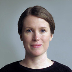
We conclude our interview and Fontlist series for our Women in Design week with Linda Hintz.
You have a background in an array of design areas and have worked for a range of clients on broad spectrum of projects including magazines, books, exhibitions and pictograms. What was your most interesting project to date?
Linda Hintz | “Generally speaking projects where the customer trusted the team were the most rewarding to work on. However working on Domus Magazine with Onlab was one of the most interesting in retrospect, mainly due to the fact it is a magazine with such a long design history. A lot of research and work that went into it, a new typeface was developed for headlines and a new organisation of the flow of articles. We actually worked in-house in Milan to design the first issue with the new layout together with the editors. To see how the concept was implemented and to have the chance to eat at an Italian canteen everyday was fantastic!”

Following a course with Luc(as) de Groot, you were inspired to enroll at Type and Media. What was the most challenging aspect of the course?
Linda Hintz | “The most challenging is the speed with which you expand your knowledge during an intense course such as this. Françoise Berserik once called it a “steam cooker“: high temperature and little time. Whether that is a good way to learn each person needs to find out for themselves. But if you want to go all in, then I would recommend it!”
You recently worked on the Demos Next typeface alongside iconic Dutch type designer Gerard Unger and Dan Reynolds. How was it to collaborate on the typeface with two other designers?
Linda Hintz | “To work on a project collaboratively is often very beneficial, because you get to exchange ideas and discuss them. For type design projects which tend to be quite long this can be motivating. Working on Demos Next was very straightforward and efficient: it was actually Gerard who was the one making decisions in the end as he did the original design. Dan started the project and handed it over to me, so we were not working on it at the same time. The way we worked with Gerard was probably very similar, we prepared proposals for the parts we were working on and discussed the direction with him.”

When can we expect to see more of Ernest, Ernie and Ernesto, the super family that you started during your TypeMedia study?
Linda Hintz | “Ernest is the heart and soul of the family, its origin. I wanted to design a text weight to figure out how a typeface can assume this task. Ernie and Ernesto are its offspring. They touch upon some other fields, introducing a little experimentation in the mix. If I feel the project is still relevant and pick it up again in the future, I will use Ernest as a starting point and take it from there. I am curious to see how I can lend it a more contemporary feel, or what the italics could look like.”
Who would you love to design a custom typeface for?
Linda Hintz | “I can think of a lot of interesting customers to do typefaces for, small scale and big scale. For a small scale cultural projects like working for a musician would be nice, but I can also think of some social initiatives and start-ups. Big scale projects for corporations have more restraints which can also be both interesting and challenging. However if I were to design for one person it would be: for Erwin Wurm, simply because his humor is just great.”
Check out Linda’s top lively text faces in her specially created Fontlist.