Discover legacy content from FontShop.com, preserved for your reference.
FF Hertz™ was just released this summer — congratulations by the way! In the typeface description, it mentions that the project was three years in the making, and that it started out as a drawing exercise on a low-resolution grid. How exactly did things start, and how coarse of an em square are we talking?

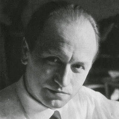
Jens Kutilek | Thank you, David! It was Tim Ahrens from Just Another Foundry who once told me that he found a good way to quickly get started with a typeface design, without getting lost in the details too soon, was to turn the resolution down in your font editor. You can’t fiddle with the curve tension or stem weights at this stage because of the coarse grid. One unit more is too much, one unit less is too little. It may not be perfect, but it’s obvious which is the best solution under the circumstances.

I started drawing the Book weight in FontLab Studio on a 180 units per em grid, which was a bit of a stupid decision that only seemed smart at the time. When I noticed I couldn’t differentiate the curve weights as much as I needed to, I doubled the resolution to 360 upm. Later I scaled everything to the common 1000 upm measure.
Why was 180 units per em a “stupid decision?”
At the time I worked in FontLab Studio. Later I switched to a UFO-based workflow (RoboFont for drawing, MetricsMachine for kerning). FontLab is not very well-behaved when it comes to scaling. Having scaled to 1000 upm, I found rounding errors everywhere. Stems were off by as much as 2 units. I had to measure everything on the final grid and correct it manually.
The reason I chose 180 upm is that I was intrigued by the old typesetting machines and their specific restrictions. The early Linotype phototypesetting machines had to use a 18 units per em spacing grid because the stepper motors couldn’t be controlled more exactly. I transferred the 18 unit spacing system to my 180 upm grid, so 1 Linotype spacing unit would be 10 units in the digital file. Which sounds like something meaningful, but further on I found that using a unit system for spacing has no merit anymore and I abandoned it. You can still see it in some places, for example the tabular figure width is still 556 units, or 10 units on the 18 unit grid. Another mystery solved for me: this curious width of 556 is still found in some Linotype fonts, even in Helvetica®, which is a giveaway they were digitized from film source material.
If anybody wanted to try the low resolution method, I’d go for something that scales without rounding errors to 1000 upm, like 250 upm for instance.

When did you know you had something?
I made my first drawings in July 2012, and immediately liked the solid appearance of the letters on the printed page. The treatment of stroke terminals and serifs changed quite drastically in this phase of the design. I had a completely different set of uppercase letters in the beginning. In order to let the project not go completely undirected, I thought about what I could use as reference. I had squarish letter forms from the start, probably because on the coarse grid these were more easy to judge than rounder forms which need more subtle nuancing. These squarish forms made Hermann Zapf’s Melior®, which I love very much, an obvious point of reference. I had also done a test digitization of a forgotten typeface by Hermann Zapf, his Mergenthaler Antiqua, which I found in a 1967 Linotype specimen book. The typeface appeared shortly before the transition from hot metal to photo typesetting and was not successful at the time, so it was never adapted to newer technologies. What I found fascinating about it was that while it was a variation of the Modern genre, and as such quite close to other designs, e.g. Century Modern, it still had Zapf’s distinct calligraphic approach showing through.


Unfortunately this calligraphic ductus is what makes most of Zapf’s typefaces hard to use for me today, because it firmly puts a 1950s air on any typographic design in which they are used. The notable exception is Aldus®, which is one of the finest book typefaces I know. So you could say I kept aspects I liked, but tried to strip all calligraphic influence from my letters before I put them into FF Hertz. Of course I didn’t copy anything directly. It’s all filtered through my brain and hand. I think my typeface is not like Melior at all when you look at it, but people notice the influence.
Experience already taught me that you have to concentrate your resources on worthy projects if you want to finish anything at all. FF Hertz was a project I worked on in my limited free time. So to test the waters I submitted my design to the FontFont typeboard in December 2012, when I only had the basic design of the Book weight and a preliminary Italic. It was very reassuring when the design was accepted. Especially Stephen Coles encouraged me to finish the typeface. It still was a lot more work than I expected, and took even longer. For example, I had never finished an italic design before. I started the Book Italic from scratch three times until I had something I felt comfortable with, and that could serve as a starting point for the other Italic weights.
Who are some of your mentors in design, and what role did they take if any in this particular work?
I never had a formal type design education. I studied graphic design and had an interest in type design, but at my university there were only general typography courses. Yet I was intrigued by the mysteries of letter forms. For example, why did fonts like Stempel™ printed from my computer never look as good as they did in older books? Now I know the answer: Because they were digitized from an already compromised form, namely the photocomposition masters, which suffered from poor technical circumstances, such as that there were no size-specific designs like in metal typesetting. Mainstream digital type designs with several optical sizes were still quite a new thing back then.
I set out to rework a Garamond typeface as a semester project, which was of course too big a venture for a novice, and turned instead into a brief analysis of the shortcomings of current OpenType fonts. Although my article can still be found, the authoritative book in this area is “Size-specific adjustments to type designs — An investigation of the principles guiding the design of optical sizes” by Tim Ahrens and Shoko Mugikura.
I didn’t really pursue type design further at that time, but I ended up specialising in the technical aspects of fonts in 2007, when I started working as font engineer for the FontFont library in Berlin. I came back to type design because I think you can’t look at and work with all those wonderful new FontFonts for several years without wanting to try your own hand at design. In a way, FF Hertz is the very delayed conclusion of my abandoned semester project 15 years ago. I’ve never been very good at drawing by hand, and I struggled with mastering Bézier curves. I would guess it really took several years to learn to draw with Béziers and get the results I wanted. It’s nothing that can be taught, except for some basic rules. It only comes to you through practice. I kept on practicing all the time, started lots of experiments which remain unreleased, but served as steps toward FF Hertz in one way or another. For FF Hertz, I made some rough sketches by hand whenever I wanted to figure some specific form out, but then always drew from scratch directly in the font editor. I was fortunate that my colleagues at FontShop, Andreas Frohloff, Christoph Koeberlin and Inka Strotmann were always willing to criticize my work in an honest and constructive way. For newly accepted FontFonts we have a so-called kick-off meeting with the designer where we scrutinize the new design closely and make suggestions for design improvements and the desired family structure. Because of our different backgrounds each of us looks at a design from a different angle, which can open up new points of view.

Later I participated in a workshop which Christian Schwartz gave in Berlin. He didn’t have any fundamental criticism on my design, which I took for a good sign, but he instantly spotted some issues that I could focus my work on, which pushed my design farther. At the time I was working on the Extra Bold and Extra Bold Italic. I was fascinated that Christian would not only give his opinion, but also put it in historical and functional context, so you could really see why a design decision should be made in this or another way. I’ve also had some help in finishing the work. I have to thank our FontFont interns Céline Odermatt and Inga Plönnigs, who worked on the petite caps. They had the tedious task to correct all the stroke weights on the unproportionally scaled-down capital letters to fit with the weight of the other letters again. In the final phase, font engineer Bernd Volmer joined me in drawing all the pesky stuff that type designers like the least, like mathematical and currency symbols, superscript numbers ...


Tell me about the decision to focus so heavily on text.
It must be my personality that rejects one-size-fits-all solutions. Which can be dangerous at times, because you can easily get overwhelmed by the sheer number of options that open up.
I would like to draw a display version of FF Hertz and call it FF Megahertz. But the current text design can work well for bigger sizes when you tighten the tracking a bit.
My urge for differentiation was probably also responsible for the two different sets of small capitals. I’m not a fan of small caps and didn’t want to include any at first. But it’s a text face, so people are rightfully expecting them. Classical typefaces have very tiny small caps, matching the size of the lower case, but my main use case for small caps would be abbreviations, for which they appear much too small. My solution was to include two sizes. The intermediate size is interpolated, so at least it was not twice the work.
And why did you pursue a uniwidth design?
When I was determining the weight and tracking changes for my Extra Bold master design, I ended up with something that was, spacing-wise, extremely similar to the Book weight. I had noticed that some typefaces like FF Balance™ had the same letter widths in all weights, and my spacing was very close so it would have been a missed opportunity not to go for uniwidth. I think it is mainly useful because the FF Hertz weights, especially Light–Regular–Book are very finely graded, so you can switch them to achieve similar color on the page for example between screen, e-book display and print, or even different kinds of paper stock.
On the old Linotype machines, the Roman style was always duplexed with the Italic because they had to share a matrix. This often led to compromised Italic forms. Italics are traditionally noticeably narrower than the Roman styles. So I allowed my Italics to have their own width, which is again uniwidth across weights.
 or in the [iTunes store](https://itunes.apple.com/us/book/the-haunter-of-the-dark/id1035171798?l=de&ls=1&mt=11)](https://lg-assets.myfonts.com/fs/uploads/content_image/attachment/189664/mini_magick20150922-15666-21z9m9.jpg)
Why the name “Hertz?”
That was a silly pun at first. Because of the Hermann Zapf influence I called the typeface “Hz”, which of course expands to the physical unit for frequency, “Hertz”, and the name stuck. Now I like it because for me it resonates with the scholarly, scientific, a bit dusty (in a good way) appearance of the typeface. I think it is very hard to change the name of a typeface later on. You get acquainted to it, and maybe the name shapes your understanding of the design as well as the other way round. You wouldn’t rename a baby either.
Trademark attribution notice
FontShop, Balance, Hertz and Stempel are trademarks of Monotype GmbH and may be registered in certain jurisdictions. FF and Linotype are trademarks of Monotype GmbH registered in the U.S. Patent and Trademark Office and may be registered in certain other jurisdictions. Aldus, Helvetica and Melior are trademarks of Monotype Imaging Inc. registered in the U.S. Patent and Trademark Office and may be registered in certain other jurisdictions. All other trademarks are property of their respective owners.