Discover legacy content from FontShop.com, preserved for your reference.

Welcome to our interview and Fontlist series as part of the FontShop Celebrates: Women in Design week. During this series we interviewed a few of our favourite female designers. We then asked them to compile their own Fontlists of their top type picks, giving reasons as to why those particular faces tickled their fancy.
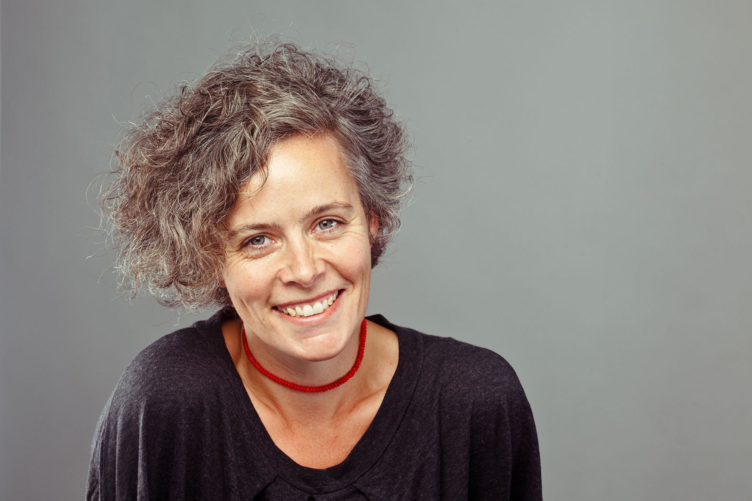
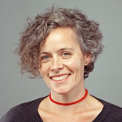
First up is Veronika Burian, co-founder of the TypeTogether foundry.
What does it mean to be running your own foundry?
Veronika Burian | “I find it very gratifying and I enjoy the freedom and independence that comes with having your own business. However it also means to invest time and money into the development of new typefaces without a guaranteed income. That’s why custom projects are so popular with type designers. And of course there are other negative sides to running a foundry, but I would not want to change a thing.”
How much work goes actually into the design of typefaces and how much into other/which parts of the business?
Veronika Burian | “As with any other self-employment, a big part of the daily work consists of anything but actual type design. However I do try to keep a good balance, between designing and everything else, such as writing, administration, customer support and project management.”
Having set up your own foundry, what advice would you give to your younger self now or to the students that you teach?
Veronika Burian | “Try to gain an understanding of the type industry, define your potential audience and study their needs. Don’t be afraid to share your experiences. Collaborate with others, keep an eye on detail and quality, and don’t forget your private life! Look at original type designs; metal type; visit the Plantin Moretus Museum and other similar ones; read about history and do some type experiments. For Latin, there is a lot of information available, workshops and after-work classes.”

You’ve lived in a whole host of countries (Prague, Germany, Austria, Italy, the USA). Was there one particular country that left a real impression upon you?
Veronika Burian | “All of them had a special effect on me as a person and therefore my work. The sum of it all is what counts for me.”
Is there one place in the world that you call home or are many places home for you?
Veronika Burian | “This sounds kitschy, but home is where my heart is. I have never felt particularly rooted in any one place. However I do feel European with a preference for the south, be it for the sun, people’s temperament or the food. I guess that’s why I ended up in Spain, for the moment at least. :-)”

Aside from type design, is there any area of design that you would like to dabble/experiment in?
Veronika Burian | “That would have to be information design and historical type research.”
Who would you love to design a custom typeface for?
Veronika Burian | “No one in particular, however creating a custom typeface and typographic concept including signage for an art or science museum would be a fantastic project.”
Although Maiola and Crete are Veronika’s only solo efforts, she collaborated on many popular type families, many of them award-winning. Discover Veronika’s top female designed typefaces in her Women in Design Fontlist.