Hannes von Döhren says, “A principle of HVD is that we want to deliver fonts of the highest quality level: optically AND technically.” As the founder and primary designer of HVD, Hannes has worked to establish and uphold this standard since he changed his focus from graphic design to type in 2008.
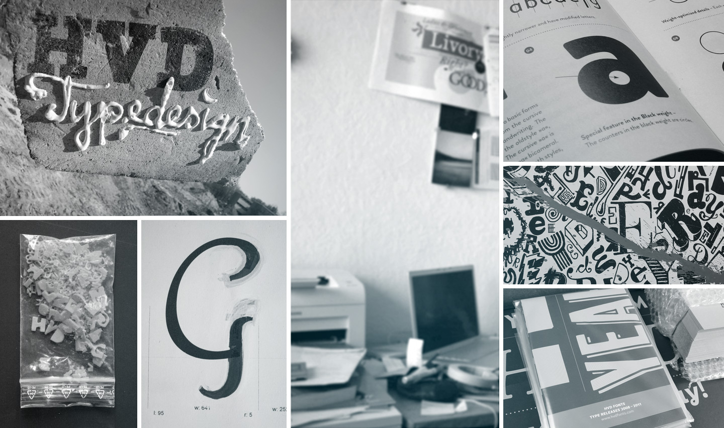 The German designer attributes the foundation of his love of typography to his years working as an art director at an advertising agency. “Typography for me is part and parcel of graphic design and advertising,” he says. “Type is often underestimated: it can accomplish so many things.”
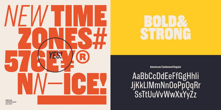
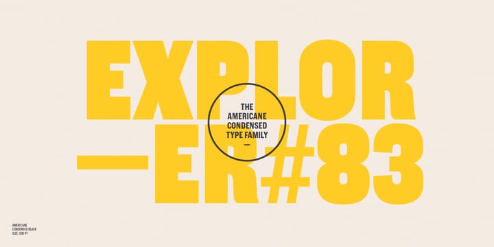
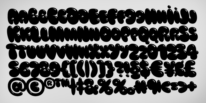
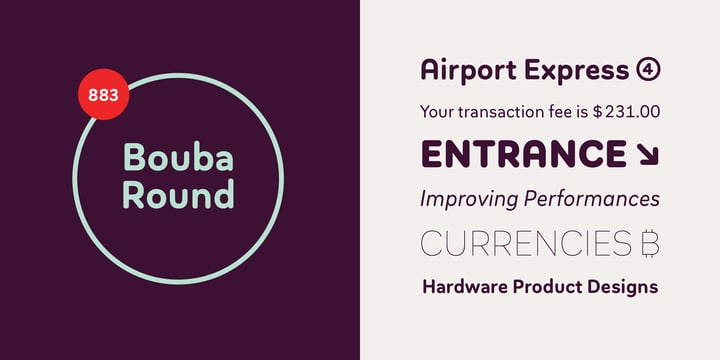
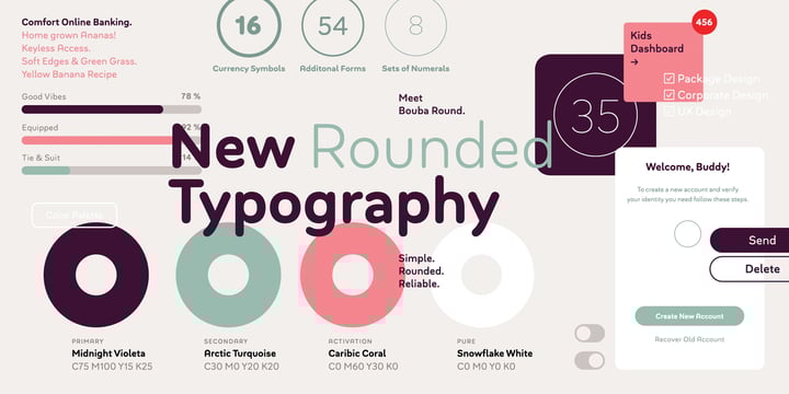
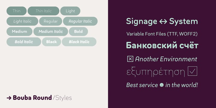
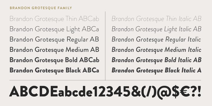
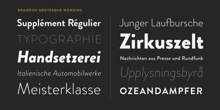
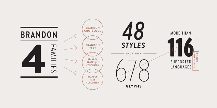
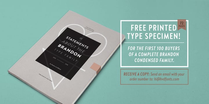
His foundry, HVD, made its MyFonts debut in March of 2009 with Embryo. Since then, his labor of love has seen great success with best-selling type families like Brandon Grotesque, Brandon Text, Pluto and Pluto Sans. Hannes credits fellow designer and lifelong friend, Livius Dietzel, as being one of HVD’s greatest supporters and contributors. The duo have created type families such as Livory, Brix Slab and FF Basic Gothic.
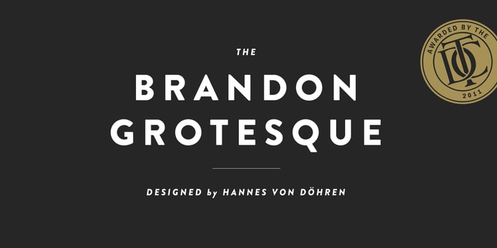
You’ve seen his work in international campaigns and incorporated into the corporate identities of companies like Amazon, Adidas, Comedy Central, Skype, New York Times Magazine, Oreo, Tom Taylor, Foot Locker, Taco Bell, McDonalds, and TypoBerlin. In 2011, he received the Certificate of Excellence in Type Design from the Type Directors Club NY.
So what is the key to Hannes von Döhren’s success? Perhaps it is the standpoint from which he approaches each type project. “I am a full time type designer,” he says, “but because I have a graphic design background, I always look at typefaces from the graphic designers perspective too. Of course typefaces should be beautiful, but they should also work perfectly in the environment that they will be used in.”
The German designer attributes the foundation of his love of typography to his years working as an art director at an advertising agency. “Typography for me is part and parcel of graphic design and advertising,” he says. “Type is often underestimated: it can accomplish so many things.”
His foundry, HVD, made its MyFonts debut in March of 2009 with Embryo. Since then, his labor of love has seen great success with best-selling type families like Brandon Grotesque, Brandon Text, Pluto and Pluto Sans. Hannes credits fellow designer and lifelong friend, Livius Dietzel, as being one of HVD’s greatest supporters and contributors. The duo have created type families such as Livory, Brix Slab and FF Basic Gothic.
You’ve seen his work in international campaigns and incorporated into the corporate identities of companies like Amazon, Adidas, Comedy Central, Skype, New York Times Magazine, Oreo, Tom Taylor, Foot Locker, Taco Bell, McDonalds, and TypoBerlin. In 2011, he received the Certificate of Excellence in Type Design from the Type Directors Club NY.
So what is the key to Hannes von Döhren’s success? Perhaps it is the standpoint from which he approaches each type project. “I am a full time type designer,” he says, “but because I have a graphic design background, I always look at typefaces from the graphic designers perspective too. Of course typefaces should be beautiful, but they should also work perfectly in the environment that they will be used in.”
 The German designer attributes the foundation of his love of typography to his years working as an art director at an advertising agency. “Typography for me is part and parcel of graphic design and advertising,” he says. “Type is often underestimated: it can accomplish so many things.”
His foundry, HVD, made its MyFonts debut in March of 2009 with Embryo. Since then, his labor of love has seen great success with best-selling type families like Brandon Grotesque, Brandon Text, Pluto and Pluto Sans. Hannes credits fellow designer and lifelong friend, Livius Dietzel, as being one of HVD’s greatest supporters and contributors. The duo have created type families such as Livory, Brix Slab and FF Basic Gothic.
You’ve seen his work in international campaigns and incorporated into the corporate identities of companies like Amazon, Adidas, Comedy Central, Skype, New York Times Magazine, Oreo, Tom Taylor, Foot Locker, Taco Bell, McDonalds, and TypoBerlin. In 2011, he received the Certificate of Excellence in Type Design from the Type Directors Club NY.
So what is the key to Hannes von Döhren’s success? Perhaps it is the standpoint from which he approaches each type project. “I am a full time type designer,” he says, “but because I have a graphic design background, I always look at typefaces from the graphic designers perspective too. Of course typefaces should be beautiful, but they should also work perfectly in the environment that they will be used in.”
The German designer attributes the foundation of his love of typography to his years working as an art director at an advertising agency. “Typography for me is part and parcel of graphic design and advertising,” he says. “Type is often underestimated: it can accomplish so many things.”
His foundry, HVD, made its MyFonts debut in March of 2009 with Embryo. Since then, his labor of love has seen great success with best-selling type families like Brandon Grotesque, Brandon Text, Pluto and Pluto Sans. Hannes credits fellow designer and lifelong friend, Livius Dietzel, as being one of HVD’s greatest supporters and contributors. The duo have created type families such as Livory, Brix Slab and FF Basic Gothic.
You’ve seen his work in international campaigns and incorporated into the corporate identities of companies like Amazon, Adidas, Comedy Central, Skype, New York Times Magazine, Oreo, Tom Taylor, Foot Locker, Taco Bell, McDonalds, and TypoBerlin. In 2011, he received the Certificate of Excellence in Type Design from the Type Directors Club NY.
So what is the key to Hannes von Döhren’s success? Perhaps it is the standpoint from which he approaches each type project. “I am a full time type designer,” he says, “but because I have a graphic design background, I always look at typefaces from the graphic designers perspective too. Of course typefaces should be beautiful, but they should also work perfectly in the environment that they will be used in.”