Select this license type when you are developing an app for iOS, Android, or Windows Phone, and you will be embedding the font file in your mobile application's code.
Aniuk
by Typejockeys
Individual Styles from $40.00
Complete family of 5 fonts: $150.00

Aniuk Font Family was
designed by
Thomas Gabriel and
published by
Typejockeys. Aniuk contains
5
styles and family package options.
More about this family
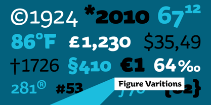
- Aa Glyphs
-
Best ValueFamily Packages
- Individual Styles
- Tech Specs
- Licensing
Per style:
$30.00
Pack of 5 styles:
$150.00
About Aniuk Font Family
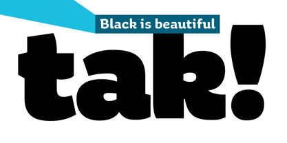
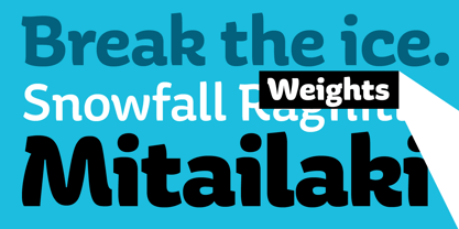
Aniuk is an original display type family from Typejockeys designed and optimized for the use in large sizes. With five robust weights—Regular, Medium, Bold, Heavy and Black—it is perfectly suited for editorial, posters or logo design. Aniuk is lively, young, and probably a little crazy. However, there certainly is one thing that it is not: boring. A perfect balance of characteristic curves and edgy details make this a strong but playful typeface. Be passionate, get emotional and express yourself with a variety of five different weights. A solid partner for your creative adventures.
Designers: Thomas Gabriel
Publisher: Typejockeys
Foundry: Typejockeys
Design Owner: Typejockeys
MyFonts debut: Jun 9, 2010
Aniuk
About Typejockeys
Typejockeys is a type foundry and graphic design company based in Vienna, Austria, established in 2008 by Anna Fahrmaier, Thomas Gabriel and Michael Hochleitner. This dynamic group does a lot of different things – from graphic design to lettering and type design. “With Typejockeys, it was never our plan solely to produce typefaces,” they said in their 2014 Creative Characters interview, “since our interest in typography extends in a lot of other directions as well. The disciplines in which we work include graphic design (such as corporate design, packaging, editorial, environmental, and digital media), type design (retail as well as custom work) and lettering, which is a little bit in-between those two, if you like.” With a library made up of typefaces that are full of spirited originality and technical precision, the group draws a lot of inspiration for their work from the city and culture of Vienna. The design for their typeface, Henriette, is actually based on the street signs in their home town. “Since we are serious type nerds, we keep looking at letters everywhere we are. Luckily, Vienna had some very talented sign makers, who over the years produced a fair amount of great shop sign letterings around the city.” “We love letters, we think about them and work with them with all our hearts. This is the meaning of the ‘serifed heart’ that you can find in all our fonts!”
Read more
Read less
- Choosing a selection results in a full page refresh.