https://cms-prod.monotype.com/sites/default/files/styles/top_hat_banner_1000_124_/public/2023-12/12%20Day%20Of%20Type%20-%20Day%208_152.png?itok=A8yWMdsD
Please update your browser. Why?

FF Fontesque

Designed by Nick Shinn in 1994. Published by FontFont as part of the FF Fontesque Super Family.

Starts at $49.99 for a single style and is available for:

Display Light

Display Light Italic

Text Regular

Text Regular Italic

Display Regular

Display Regular Italic

Text Bold Italic

Display Bold

Display Bold Italic

Extra Bold

Display Extra Bold

Type to compare other characters
&
Extra Bold
&
Text Regular
&
Text Bold
&
Display Light
&
Display Regular
&
Display Bold
&
Display Extra Bold
&
120
Bei jedem klugen Wort von Sokrates ruft Xanthippe zynisch: Quatsch! Dabei grüßt die Quellnixe freundlich am Bach. Verflixt öde …
70
Bei jedem klugen Wort von Sokrates ruft Xanthippe zynisch: Quatsch! Dabei grüßt die Quellnixe freundlich am Bach. Verflixt öde …
40
Bei jedem klugen Wort von Sokrates ruft Xanthippe zynisch: Quatsch! Dabei grüßt die Quellnixe freundlich am Bach. Verflixt öde …
25
Bei jedem klugen Wort von Sokrates ruft Xanthippe zynisch: Quatsch! Dabei grüßt die Quellnixe freundlich am Bach. Verflixt öde …
18
Bei jedem klugen Wort von Sokrates ruft Xanthippe zynisch: Quatsch! Dabei grüßt die Quellnixe freundlich am Bach. Verflixt öde …
12
Bei jedem klugen Wort von Sokrates ruft Xanthippe zynisch: Quatsch! Dabei grüßt die Quellnixe freundlich am Bach. Verflixt öde …

FF Fontesque supports up to 106 different languages such as Spanish, English, Portuguese, Russian, German, French, Turkish, Italian, Polish, Ukrainian, Uzbek, Kurdish (Latin), Azerbaijani (Latin), Romanian, Dutch, Hungarian, Czech, Serbian (Latin), Serbian (Cyrillic), Kazakh (Latin), Bulgarian, Swedish, Belarusian (Latin), Belarusian (Cyrillic), Croatian, Finnish, Slovak, Danish, Lithuanian, Latvian, Slovenian, Irish, Estonian, Basque, Icelandic, and Luxembourgian in Latin, Cyrillic, and other scripts.

Please note that not all languages are available for all formats.

View all 106 languages

Leitão à Bairrada
Köttbullar
Poronkäristys
Tambëloriz

Languages

Please select a product:

Supports 50 different languages:

  • A
  • Afar
  • Afrikaans
  • Albanian
  • Asturian
  • B
  • Basque
  • Breton
  • C
  • Catalan
  • Cornish
  • Corsican
  • D
  • Danish
  • Dutch
  • E
  • English
  • F
  • Faroese
  • Fijian
  • Finnish
  • French
  • Frisian
  • Friulian
  • G
  • Gaelic (Scottish)
  • Galician
  • German
  • I
  • Icelandic
  • Indonesian
  • Irish
  • Italian
  • K
  • Kinyarwanda (Ruanda)
  • Kirundi (Rundi)
  • L
  • Ladin
  • Luxembourgian
  • M
  • Malay (Latin)
  • N
  • Norwegian
  • O
  • Occitan
  • Oromo (Afan, Galla)
  • P
  • Papiamentu
  • Portuguese
  • Q
  • Quechua
  • R
  • Rhaeto-Romance
  • S
  • Sardinian
  • Shona
  • Somali
  • Spanish
  • Swahili (Kiswahili)
  • Swedish
  • T
  • Tagalog
  • Tsonga
  • Tswana
  • U
  • Uighur
  • W
  • Walloon
  • X
  • Xhosa
  • Z
  • Zulu
The
Black
Phlegmatics
Tabular Figures
| 167
| 167
Proportional Figures
| 167
| 167
Lining Figures
| 167
| 167
Oldstyle Figures
| 167
| 167
Changes figures from the default lining style to oldstyle form.
Standard Ligatures
| flfi
| flfi
Historical Forms
| hist
| hist
Replaces letters with historical variants that may appear anachronistic today. The best-known example is the long form of s.
Case-Sensitive Forms
| (H-o)
| (H-o)
Shifts punctuation up to a position that works better with all-caps text.
Ordinals
| 1a2o
| 1a2o
Replaces characters with ordinal forms for use after figures.
View this style in detail
I am a minimalist. I like saying the most with the least.
— Bob Newhart
View this style in detail
Punctuation
!
"
#
%
&
'
(
)
*
,
-
.
/
:
;
?
@
[
\
]
^
_
`
{
}
¡
§
¨
¯
´
·
¸
¿
Uppercase
A
B
C
D
E
F
G
H
I
J
K
L
M
N
O
P
Q
R
S
T
U
V
W
X
Y
Z
Lowercase
a
b
c
d
e
f
g
h
i
j
k
l
m
n
o
p
q
r
s
t
u
v
w
x
y
z
Phonetic Extensions
ə
Modifiers
ʻ
ʼ
ˆ
ˇ
˘
˙
˚
˛
˜
˝
Combining Diacritical Marks
̀
́
̂
̃
̄
̆
̇
̈
̊
̋
̌
̒
̓
̦
̧
̨
Ligatures
Currency
$
¢
£
¤
¥
Symbols
+
<
=
>
|
~
¬
±
×
÷
Decimal
0
1
2
3
4
5
6
7
8
9
Other
²
³
¹
¼
½
¾
Mathematical Operators
Miscellaneous
¦
©
®
°
Letterlike
Arrows
Geometric Shapes
Lowercase
µ
ß
à
á
â
ã
ä
å
æ
ç
è
é
ê
ë
ì
í
î
ï
ð
ñ
ò
ó
ô
õ
ö
ø
ù
ú
û
ü
ý
þ
ÿ
ā
ă
ą
ć
ĉ
ċ
č
ď
đ
ē
ĕ
ė
ę
ě
ĝ
ğ
ġ
ģ
ĥ
ħ
ĩ
ī
ĭ
į
ı
ij
ĵ
ķ
ĸ
ĺ
ļ
ľ
ŀ
ł
ń
ņ
ň
ʼn
ŋ
ō
ŏ
ő
œ
ŕ
ŗ
ř
ś
ŝ
ş
š
ţ
ť
ŧ
ũ
ū
ŭ
ů
ű
ų
ŵ
ŷ
ź
ż
ž
ſ
ƒ
ǻ
ǽ
ǿ
ș
ț
ȷ
Uppercase
À
Á
Â
Ã
Ä
Å
Æ
Ç
È
É
Ê
Ë
Ì
Í
Î
Ï
Ð
Ñ
Ò
Ó
Ô
Õ
Ö
Ø
Ù
Ú
Û
Ü
Ý
Þ
Ā
Ă
Ą
Ć
Ĉ
Ċ
Č
Ď
Đ
Ē
Ĕ
Ė
Ę
Ě
Ĝ
Ğ
Ġ
Ģ
Ĥ
Ħ
Ĩ
Ī
Ĭ
Į
İ
IJ
Ĵ
Ķ
Ĺ
Ļ
Ľ
Ŀ
Ł
Ń
Ņ
Ň
Ŋ
Ō
Ŏ
Ő
Œ
Ŕ
Ŗ
Ř
Ś
Ŝ
Ş
Š
Ţ
Ť
Ŧ
Ũ
Ū
Ŭ
Ů
Ű
Ų
Ŵ
Ŷ
Ÿ
Ź
Ż
Ž
Ə
Ǻ
Ǽ
Ǿ
Ș
Ț
Uppercase
Δ
Ω
Lowercase
μ
π
Uppercase
Ѐ
Ё
Ђ
Ѓ
Є
Ѕ
І
Ї
Ј
Љ
Њ
Ћ
Ќ
Ѝ
Ў
Џ
А
Б
В
Г
Д
Е
Ж
З
И
Й
К
Л
М
Н
О
П
Р
С
Т
У
Ф
Х
Ц
Ч
Ш
Щ
Ъ
Ы
Ь
Э
Ю
Я
Ґ
Ғ
Җ
Қ
Ң
Ү
Ұ
Ҳ
Ҷ
Һ
Ӏ
Ә
Ӣ
Ө
Ӯ
Lowercase
а
б
в
г
д
е
ж
з
и
й
к
л
м
н
о
п
р
с
т
у
ф
х
ц
ч
ш
щ
ъ
ы
ь
э
ю
я
ѐ
ё
ђ
ѓ
є
ѕ
і
ї
ј
љ
њ
ћ
ќ
ѝ
ў
џ
ґ
ғ
җ
қ
ң
ү
ұ
ҳ
ҷ
һ
ӏ
ә
ӣ
ө
ӯ

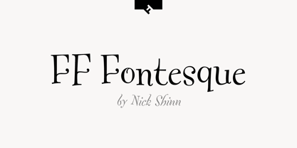
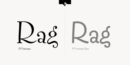
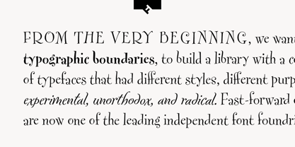
In your mind, you know what the letters should look like. That’s why FF Fontesque’s funhouse-mirror–style distortion is so successful at disorienting and drawing in the unsuspecting onlooker. The typeface keeps it loose with extreme proportions, unpredictable character axis, a bouncing baseline, and wild variation of stroke weight. The designer, Nick Shinn, argues that all the irregularity only aids its legibility, holding up for contrast the modernist idea that ‘similar things should look the same’ with the example of the word ‘sea’ set in Helvetica. “…with its six similar spaces, you can see what I’ve tried to avoid.” FF Fontesque isn’t a one-off novelty piece; its range of weights and styles shows real commitment. In addition to the original four-weight Display family, complete with italics in all but the heaviest weight, a more robust Text variant was also developed for use at smaller sizes. As an encore, the family was expanded to include a five-weight FF Fontesque Sans in 2011, a linear interpretation of the design that functions primarily at display and larger text sizes.

FF Fontesque has 12 Styles