https://cms-prod.monotype.com/sites/default/files/styles/top_hat_banner_1000_124_/public/2023-03/TCE-Tophat_147.png?itok=jrRQilQ7
Please update your browser. Why?

FF Good

Sturdy and legible, a straight-sided sans serif
in the American Gothic tradition. The largest FontFont family ever!

Designed by Lukasz Dziedzic in 2007, 2010. Published by FontFont.

Starts at $55.99 for a single style and is available for:

Condensed Light

Condensed Light Italic

Condensed Regular

Condensed Regular Italic

Condensed News

Condensed News Italic

Condensed Medium

Condensed Medium Italic

Condensed Bold

Condensed Bold Italic

Condensed Black

Condensed Black Italic

Condensed Ultra

Condensed Ultra Italic

Narrow Light

Narrow Light Italic

Narrow Regular

Narrow Regular Italic

Narrow Medium

Narrow Medium Italic

Narrow Bold

Narrow Bold Italic

Narrow Black Italic

Narrow Ultra Italic

Extra Condensed Light

Extra Condensed Light Italic

Extra Condensed Regular

Extra Condensed Regular Italic

Extra Condensed Medium

Extra Condensed Medium Italic

Extra Condensed Bold

Extra Condensed Bold Italic

Extra Condensed Black

Extra Condensed Black Italic

Extra Condensed Ultra

Extra Condensed Ultra Italic

Compressed Light

Compressed Light Italic

Compressed Regular

Compressed Regular Italic

Compressed Medium

Compressed Medium Italic

Compressed Bold

Compressed Bold Italic

Compressed Black

Compressed Black Italic

Compressed Ultra

Compressed Ultra Italic

Extended Light

Extended Light Italic

Extended Regular

Extended Regular Italic

Extended Medium

Extended Medium Italic

Extended Bold

Extended Bold Italic

Extended Black

Extended Black Italic

Extended Ultra

Extended Ultra Italic

Wide Regular

Wide Regular Italic

Wide News Italic

Wide Medium Italic

Wide Bold Italic

Wide Black

Wide Black Italic

Wide Ultra Italic

Type to compare other characters
©
Light
©
Regular
©
News
©
Medium
©
Bold
©
Black
©
Ultra
©
Condensed Light
©
Condensed Regular
©
Condensed News
©
Condensed Medium
©
Condensed Bold
©
Condensed Black
©
Condensed Ultra
©
Narrow Light
©
Narrow Regular
©
Narrow Medium
©
Narrow Bold
©
Narrow Black
©
Narrow Ultra
©
Extra Condensed Light
©
Extra Condensed Regular
©
Extra Condensed Medium
©
Extra Condensed Bold
©
Extra Condensed Black
©
Extra Condensed Ultra
©
Compressed Light
©
Compressed Regular
©
Compressed Medium
©
Compressed Bold
©
Compressed Black
©
Compressed Ultra
©
Extended Light
©
Extended Regular
©
Extended Medium
©
Extended Bold
©
Extended Black
©
Extended Ultra
©
Wide Light
©
Wide Regular
©
Wide News
©
Wide Medium
©
Wide Bold
©
Wide Black
©
Wide Ultra
©
120
Six big juicy steaks sizzled in the pan as five workmen left the quarry. The jukebox music puzzled a gentle visitor from a quaint valley town.
70
Six big juicy steaks sizzled in the pan as five workmen left the quarry. The jukebox music puzzled a gentle visitor from a quaint valley town.
40
Six big juicy steaks sizzled in the pan as five workmen left the quarry. The jukebox music puzzled a gentle visitor from a quaint valley town.
25
Six big juicy steaks sizzled in the pan as five workmen left the quarry. The jukebox music puzzled a gentle visitor from a quaint valley town.
18
Six big juicy steaks sizzled in the pan as five workmen left the quarry. The jukebox music puzzled a gentle visitor from a quaint valley town.
12
Six big juicy steaks sizzled in the pan as five workmen left the quarry. The jukebox music puzzled a gentle visitor from a quaint valley town.

FF Good supports up to 108 different languages such as Spanish, English, Portuguese, Russian, German, French, Turkish, Italian, Polish, Ukrainian, Uzbek, Kurdish (Latin), Azerbaijani (Latin), Azerbaijani (Cyrillic), Romanian, Dutch, Hungarian, Czech, Serbian (Cyrillic), Kazakh (Latin), Serbian (Latin), Bulgarian, Swedish, Belarusian (Cyrillic), Belarusian (Latin), Croatian, Slovak, Finnish, Danish, Lithuanian, Latvian, Slovenian, Irish, Estonian, Basque, Icelandic, and Luxembourgian in Latin, Cyrillic, and other scripts.

Please note that not all languages are available for all formats.

View all 108 languages

Hepčí
Rülps
Byääh
Ням-ням
Prööt
Güm güm

Languages

Please select a product:

Supports 108 different languages:

  • A
  • Adyghe
  • Afar
  • Afrikaans
  • Albanian
  • Asturian
  • Aymara
  • Azerbaijani (Cyrillic)
  • Azerbaijani (Latin)
  • B
  • Basque
  • Belarusian (Cyrillic)
  • Belarusian (Latin)
  • Bosnian (Latin)
  • Breton
  • Bulgarian
  • C
  • Catalan
  • Chechen (Cyrillic)
  • Chichewa
  • Cornish
  • Corsican
  • Croatian
  • Czech
  • D
  • Danish
  • Dutch
  • E
  • English
  • Erzya
  • Esperanto
  • Estonian
  • F
  • Faroese
  • Fijian
  • Finnish
  • French
  • Frisian
  • Friulian
  • G
  • Gaelic (Scottish)
  • Galician
  • German
  • Greenlandic
  • H
  • Hungarian
  • I
  • Icelandic
  • Indonesian
  • Ingush
  • Irish
  • Italian
  • K
  • Kabardian
  • Kalmyk
  • Karachay-Balkar
  • Karelian
  • Kazakh (Latin)
  • Kinyarwanda (Ruanda)
  • Kirghiz
  • Kirundi (Rundi)
  • Kumyk
  • Kurdish (Latin)
  • L
  • Ladin
  • Lak
  • Latin
  • Latvian
  • Lezgi
  • Lithuanian
  • Luxembourgian
  • M
  • Macedonian
  • Malagasy
  • Malay (Latin)
  • Maltese
  • Maori
  • Moksha
  • Mongolian (Cyrillic)
  • N
  • Norwegian
  • O
  • Occitan
  • Oromo (Afan, Galla)
  • P
  • Papiamentu
  • Polish
  • Portuguese
  • Q
  • Quechua
  • R
  • Rhaeto-Romance
  • Romani (Latin)
  • Romanian
  • Russian
  • Rusyn
  • Rutul
  • S
  • Samoan
  • Sardinian
  • Serbian (Cyrillic)
  • Serbian (Latin)
  • Shona
  • Slovak
  • Slovenian
  • Somali
  • Sorbian, Upper
  • Spanish
  • Swahili (Kiswahili)
  • Swedish
  • T
  • Tabasaran
  • Tagalog
  • Tahitian
  • Tatar
  • Tsonga
  • Tswana
  • Turkish
  • Turkmen
  • U
  • Uighur
  • Ukrainian
  • Uzbek
  • W
  • Walloon
  • Welsh
  • Wolof
  • X
  • Xhosa
  • Z
  • Zulu
Noel Gallagher may not read it
Noel Gallagher’s statement that reading fiction is a “fucking waste of time” and readers are “putting themselves a tiny little bit above the rest of us” – is a valuable contribution.
Cathy Nicol: Isle of Joy
Vince Smith met bandmates Jim Kelly and Nancy Gibbs at a Sex Pistols concert, where he tried to kiss Sid Vicious’ guitar and got a bloody nose. Together they formed Aftershock, and for a while they made a lot of noise, a bit of money and caused a sensation wherever they went.
Fractions
| 1/2
| 1/2
Superscript
| 123
| 123
Oldstyle Figures
| 167
| 167
Tabular Figures
| 167
| 167
Proportional Figures
| 167
| 167
Subscript
| 123
| 123
Lining Figures
| 167
| 167
Changes figures from oldstyle to the default lining form.
Required Ligatures
| ï»»
| ï»»
Historical Forms
| hist
| hist
Standard Ligatures
| flfi
| flfi
Replaces a sequence of glyphs with a ligature. Active by default.
Small Capitals From Capitals
| CAPS
| CAPS
Small Capitals
| Small
| Small
Case-Sensitive Forms
| (H-o)
| (H-o)
Shifts punctuation up to a position that works better with all-caps text.
Ordinals
| 1a2o
| 1a2o
Replaces characters with ordinal forms for use after figures.
View this style in detail
Why are our days numbered and not, say, lettered?
— Woody Allen
View this style in detail
Punctuation
!
"
#
%
&
'
(
)
*
,
-
.
/
:
;
?
@
[
\
]
^
_
`
{
}
¡
§
¨
¯
´
·
¸
¿
Uppercase
A
B
C
D
E
F
G
H
I
J
K
L
M
N
O
P
Q
R
S
T
U
V
W
X
Y
Z
Lowercase
a
b
c
d
e
f
g
h
i
j
k
l
m
n
o
p
q
r
s
t
u
v
w
x
y
z
Phonetic Extensions
ə
Modifiers
ʻ
ʼ
ˆ
ˇ
˘
˙
˚
˛
˜
˝
Combining Diacritical Marks
̀
́
̂
̃
̄
̆
̇
̈
̊
̋
̌
̒
̕
̦
̧
̨
̵
̶
Ligatures
Currency
$
¢
£
¤
¥
Symbols
+
<
=
>
|
~
¬
±
×
÷
Decimal
0
1
2
3
4
5
6
7
8
9
Other
²
³
¹
¼
½
¾
Mathematical Operators
Superscripts and Subscripts
Number Forms
Miscellaneous
¦
©
®
°
Letterlike
Geometric Shapes
Lowercase
µ
ß
à
á
â
ã
ä
å
æ
ç
è
é
ê
ë
ì
í
î
ï
ð
ñ
ò
ó
ô
õ
ö
ø
ù
ú
û
ü
ý
þ
ÿ
ā
ă
ą
ć
ĉ
ċ
č
ď
đ
ē
ĕ
ė
ę
ě
ĝ
ğ
ġ
ģ
ĥ
ħ
ĩ
ī
ĭ
į
ı
ij
ĵ
ķ
ĸ
ĺ
ļ
ľ
ŀ
ł
ń
ņ
ň
ʼn
ŋ
ō
ŏ
ő
œ
ŕ
ŗ
ř
ś
ŝ
ş
š
ţ
ť
ŧ
ũ
ū
ŭ
ů
ű
ų
ŵ
ŷ
ź
ż
ž
ſ
ƒ
ƶ
ǻ
ǽ
ǿ
ș
ț
ȷ
Uppercase
À
Á
Â
Ã
Ä
Å
Æ
Ç
È
É
Ê
Ë
Ì
Í
Î
Ï
Ð
Ñ
Ò
Ó
Ô
Õ
Ö
Ø
Ù
Ú
Û
Ü
Ý
Þ
Ā
Ă
Ą
Ć
Ĉ
Ċ
Č
Ď
Đ
Ē
Ĕ
Ė
Ę
Ě
Ĝ
Ğ
Ġ
Ģ
Ĥ
Ħ
Ĩ
Ī
Ĭ
Į
İ
IJ
Ĵ
Ķ
Ĺ
Ļ
Ľ
Ŀ
Ł
Ń
Ņ
Ň
Ŋ
Ō
Ŏ
Ő
Œ
Ŕ
Ŗ
Ř
Ś
Ŝ
Ş
Š
Ţ
Ť
Ŧ
Ũ
Ū
Ŭ
Ů
Ű
Ų
Ŵ
Ŷ
Ÿ
Ź
Ż
Ž
Ə
Ƶ
Ǻ
Ǽ
Ǿ
Ș
Ț
Uppercase
Δ
Ω
Lowercase
μ
π
Uppercase
Ѐ
Ё
Ђ
Ѓ
Є
Ѕ
І
Ї
Ј
Љ
Њ
Ћ
Ќ
Ѝ
Ў
Џ
А
Б
В
Г
Д
Е
Ж
З
И
Й
К
Л
М
Н
О
П
Р
С
Т
У
Ф
Х
Ц
Ч
Ш
Щ
Ъ
Ы
Ь
Э
Ю
Я
Ѣ
Ѳ
Ѵ
Ґ
Ғ
Җ
Қ
Ҝ
Ң
Ү
Ұ
Ҳ
Ҷ
Ҹ
Һ
Ӏ
Ә
Ӣ
Ө
Ӯ
Lowercase
а
б
в
г
д
е
ж
з
и
й
к
л
м
н
о
п
р
с
т
у
ф
х
ц
ч
ш
щ
ъ
ы
ь
э
ю
я
ѐ
ё
ђ
ѓ
є
ѕ
і
ї
ј
љ
њ
ћ
ќ
ѝ
ў
џ
ѣ
ѳ
ѵ
ґ
ғ
җ
қ
ҝ
ң
ү
ұ
ҳ
ҷ
ҹ
һ
ӏ
ә
ӣ
ө
ӯ
Other Private Use

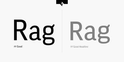
FF Good is a straight-sided sans serif in the American Gothic tradition, designed by Warsaw-based Łukasz Dziedzic. Despite having something of an “old-fashioned” heritage, FF Good feels new. Many customers agree: the sturdy, legible forms of FF Good have been put to good use in the Polish-language magazine ‘Komputer Swiat,’ the German and Russian edition of the celebrity tabloid OK!, and the new corporate design for the Associated Press.

Although initially released as a family of modest size, the typeface was fully overhauled in 2010, increasing it from nine styles to 30 styles, with an additional 30-style sibling for larger sizes, FF Good Headline. In 2014, the type system underwent additional expansion to become FontFont’s largest family ever with an incredible 196 total styles. This includes seven weights ranging from Light to Ultra, and an astonishing seven widths from Compressed to Extended for both FF Good and FF Good Headline, all with companion italics and small caps in both roman and italic. With its subtle weight and width graduation, it is the perfect companion for interface, editorial, and web designers. This allows the typographer to pick the style best suited to their layout.

As a contemporary competitor to classic American Gothic style typefaces—like Franklin Gothic, News Gothic, or Trade Gothic—it was necessary that an expanded FF Good also offers customers both Text and Display versions. The base FF Good fonts are mastered for text use, while FF Good Headline aims for maximum compactness. Its low cap height together with trimmed ascenders and descenders give punch to headlines and larger-sized copy in publications such as newspapers, magazines, and blogs.

There is even more good news about FF Good: it has something of a serif companion. Łukasz Dziedzic built FF Good to work together with FF More, creating in a powerhouse superfamily that is versatile in both its function and aesthetic.

FF Good has 90 Styles