FF Real Text Pro Hairline Oblique
FF Real Text Pro Thin Oblique
FF Real Text Pro Ultralight Oblique
FF Real Text Pro Extralight Oblique
FF Real Text Pro Light Oblique
FF Real Text Pro Semilight Oblique
FF Real Text Pro Regular Oblique
FF Real Text Pro Book Oblique
FF Real Text Pro Medium Oblique
FF Real Text Pro Demibold Oblique
FF Real Text Pro Bold Oblique
FF Real Text Pro Extrabold Oblique
FF Real Text Pro Black Oblique
FF Real Text Pro Condensed Hairline
FF Real Text Pro Condensed Hairline Oblique
FF Real Text Pro Condensed Thin
FF Real Text Pro Condensed Thin Oblique
FF Real Text Pro Condensed UltraLight
FF Real Text Pro Condensed UltraLight Oblique
FF Real Text Pro Condensed ExtraLight
FF Real Text Pro Condensed ExtraLight Oblique
FF Real Text Pro Condensed Light
FF Real Text Pro Condensed Light Oblique
FF Real Text Pro Condensed SemiLight
FF Real Text Pro Condensed SemiLight Oblique
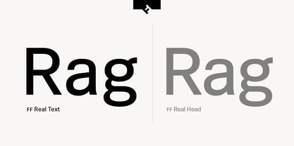
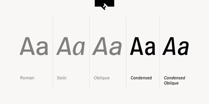
FF Real Text Pro Condensed
FF Real Text Pro Condensed Oblique
FF Real Text Pro Condensed Book
FF Real Text Pro Condensed Book Oblique
FF Real Text Pro Condensed Medium
FF Real Text Pro Condensed Medium Oblique
FF Real Text Pro Condensed DemiBold
FF Real Text Pro Condensed DemiBold Oblique
FF Real Text Pro Condensed Bold
FF Real Text Pro Condensed Bold Oblique
FF Real Text Pro Condensed ExtraBold
FF Real Text Pro Condensed ExtraBold Oblique
FF Real Text Pro Condensed Black
FF Real Text Pro Condensed Black Oblique
FF Real Text Pro Hairline
FF Real Text Pro Hairline Italic
FF Real Text Pro Ultralight
FF Real Text Pro Ultralight Italic
FF Real Text Pro Thin
FF Real Text Pro Thin Italic
FF Real Text Pro Extralight
FF Real Text Pro Extralight Italic
FF Real Text Pro Light
FF Real Text Pro Light Italic
FF Real Text Pro Semilight
FF Real Text Pro Semilight Italic
FF Real Text Pro Book
FF Real Text Pro Book Italic
FF Real Text Pro Regular
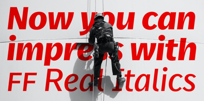
FF Real Text Pro Italic
FF Real Text Pro Medium
FF Real Text Pro Medium Italic
FF Real Text Pro Demibold
FF Real Text Pro Demibold Italic
FF Real Text Pro Bold
FF Real Text Pro Bold Italic
FF Real Text Pro Extrabold
FF Real Text Pro Extrabold Italic
FF Real Text Pro Black
FF Real Text Pro Black Italic