Select this license type when you are developing an app for iOS, Android, or Windows Phone, and you will be embedding the font file in your mobile application's code.
Henriette™
by Typejockeys
Individual Styles from $0.00
Complete family of 31 fonts: $520.00

Henriette Font Family was
designed by
Michael Hochleitner and
published by
Typejockeys. Henriette contains
31
styles and family package options.
More about this family
- Aa Glyphs
-
Best ValueFamily Packages
- Individual Styles
- Tech Specs
- Licensing
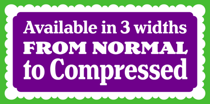
Henriette Compressed
11 fontsPer style:
$32.72
Pack of 11 styles:
$360.00
About Henriette Font Family
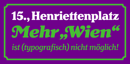
The redefinition of a classic In the 1920s the Viennese government decided to standardize the street signs across the city. A typeface was especially constructed for the purpose. It was available in a Heavy and a Bold Condensed version, to support short street names as well as longer ones. As the years went by, the typeface was adopted and redrawn by several enamel factories. These adaptations lead to variations on the design, and to the fact that there isn’t a Viennese street sign font but 16 – in part severely – different versions. Henriette is not a digitization of any of those versions; rather, it is influenced by all of them. The italic versions are completely original and designed to accompany the Roman.
Designers: Michael Hochleitner
Publisher: Typejockeys
Foundry: Typejockeys
Design Owner: Typejockeys
MyFonts debut: Jul 18, 2012
Henriette™
is a trademark of Typejockeys.
About Typejockeys
Typejockeys is a type foundry and graphic design company based in Vienna, Austria, established in 2008 by Anna Fahrmaier, Thomas Gabriel and Michael Hochleitner. This dynamic group does a lot of different things – from graphic design to lettering and type design. “With Typejockeys, it was never our plan solely to produce typefaces,” they said in their 2014 Creative Characters interview, “since our interest in typography extends in a lot of other directions as well. The disciplines in which we work include graphic design (such as corporate design, packaging, editorial, environmental, and digital media), type design (retail as well as custom work) and lettering, which is a little bit in-between those two, if you like.” With a library made up of typefaces that are full of spirited originality and technical precision, the group draws a lot of inspiration for their work from the city and culture of Vienna. The design for their typeface, Henriette, is actually based on the street signs in their home town. “Since we are serious type nerds, we keep looking at letters everywhere we are. Luckily, Vienna had some very talented sign makers, who over the years produced a fair amount of great shop sign letterings around the city.” “We love letters, we think about them and work with them with all our hearts. This is the meaning of the ‘serifed heart’ that you can find in all our fonts!”
Read more
Read less
- Choosing a selection results in a full page refresh.