Select this license type when you are developing an app for iOS, Android, or Windows Phone, and you will be embedding the font file in your mobile application's code.
Ingeborg™
by Typejockeys
Individual Styles from $25.00
Complete family of 10 fonts: $360.00

Ingeborg Font Family was
designed by
Michael Hochleitner and
published by
Typejockeys. Ingeborg contains
10
styles and family package options.
More about this family
- Aa Glyphs
-
Best ValueFamily Packages
- Individual Styles
- Tech Specs
- Licensing
Per style:
$36.00
Pack of 10 styles:
$360.00
Ingeborg Display Set
6 fontsPer style:
$33.33
Pack of 6 styles:
$200.00
Ingeborg Text Set
4 fontsPer style:
$50.00
Pack of 4 styles:
$200.00
About Ingeborg Font Family
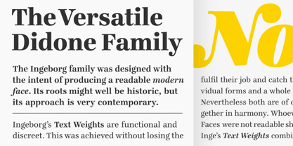
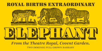
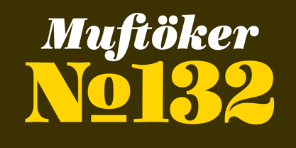
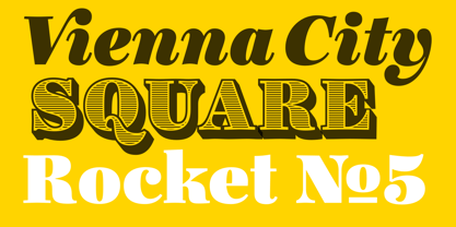
The Ingeborg family was designed with the intent of producing a readable modern face. Its roots might well be historic, but its approach is very contemporary. Ingeborg’s Text Weights are functional and discreet. This was achieved without losing the classic characteristics of a Didone typeface, which are the vertical stress and the high contrast. The Display Weights on the other hand are designed to fulfil their job and catch the reader’s eye by individual form language and a whole lot of ink on the paper. Nevertheless both are of one origin and work together in harmony.
Designers: Michael Hochleitner
Publisher: Typejockeys
Foundry: Typejockeys
Original Foundry: unknown
Design Owner: Typejockeys
MyFonts debut: Jul 24, 2009
Ingeborg™
is a trademark of Typejockeys.
About Typejockeys
Typejockeys is a type foundry and graphic design company based in Vienna, Austria, established in 2008 by Anna Fahrmaier, Thomas Gabriel and Michael Hochleitner. This dynamic group does a lot of different things – from graphic design to lettering and type design. “With Typejockeys, it was never our plan solely to produce typefaces,” they said in their 2014 Creative Characters interview, “since our interest in typography extends in a lot of other directions as well. The disciplines in which we work include graphic design (such as corporate design, packaging, editorial, environmental, and digital media), type design (retail as well as custom work) and lettering, which is a little bit in-between those two, if you like.” With a library made up of typefaces that are full of spirited originality and technical precision, the group draws a lot of inspiration for their work from the city and culture of Vienna. The design for their typeface, Henriette, is actually based on the street signs in their home town. “Since we are serious type nerds, we keep looking at letters everywhere we are. Luckily, Vienna had some very talented sign makers, who over the years produced a fair amount of great shop sign letterings around the city.” “We love letters, we think about them and work with them with all our hearts. This is the meaning of the ‘serifed heart’ that you can find in all our fonts!”
Read more
Read less
- Choosing a selection results in a full page refresh.