Select this license type when you are developing an app for iOS, Android, or Windows Phone, and you will be embedding the font file in your mobile application's code.
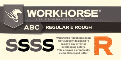
Workhorse
by Borges Lettering
Individual Styles from $35.00
Complete family of 2 fonts: $65.00

Workhorse Font Family was
designed by
Charles Borges de Oliveira,
Greg Reid and
published by
Borges Lettering. Workhorse contains
2
styles and family package options.
More about this family
- Aa Glyphs
-
Best ValueFamily Packages
- Individual Styles
- Tech Specs
- Licensing
Per style:
$32.50
Pack of 2 styles:
$65.00
About Workhorse Font Family
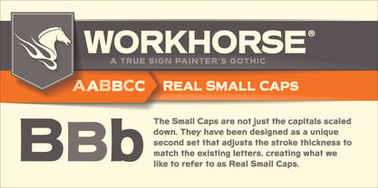
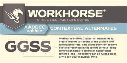
Workhorse is a Sign Painter’s Gothic developed by Master Sign Painter Greg Reid. Workhorse captures the true essence of hand lettering. From the tapered waists to the elegant snaps of the brush; these elements present a warmth unseen in today’s mechanically stiff Gothics. Greg Reid and Charles Borges de Oliveira collaborated to bring this truly one of a kind typeface to fruition. With the power of Open type, Workhorse utilizes Contextual Alternates to create random variations of the capitals and lowercase letters. This allows your text to have subtle differences in the letters without losing form which helps to create an honest hand lettered look. This feature can be turned on or off to suit your individual style. You also have the ability to manually choose the glyph variations from the glyph pallet to help you create one of kind designs. Both versions of Workhorse feature complete variations of the capitals and lowercase letters (56 total), Small Caps and six alternates. The Small Caps are not just the capitals scaled down. They have been designed as a unique second set that adjusts the stroke thickness to match the existing letters, creating what we like to refer to as “Real Small Caps”. Workhorse is a timeless classic that can be used from early Americana advertising all the way up to present day modern use. No matter how you use Workhorse it always looks and reads well.
Designers: Charles Borges de Oliveira, Greg Reid
Publisher: Borges Lettering
Foundry: Borges Lettering
Design Owner: Borges Lettering
MyFonts debut: Nov 12, 2014
Workhorse
About Borges Lettering
The first letterforms that Charles Borges de Oliveira perfected were done with paint and a brush. As an apprentice sign painter, the designer learned to appreciate letters and all that goes into their creation. When he applied these skills and made a font for his wife called Sarah Script, he knew that his love for letters had evolved into a new medium. A studio offering high quality fonts as well as custom hand-lettering work, Borges Lettering was founded in 2003. Charles’ debut font, Sarah Script, blazed a trail for success that many of his fonts have since followed. Two of his typefaces, Louisiana and Alpine Script, have been featured in our Rising Stars Newsletters and both spent time on our Best Seller list. “I think what makes our foundry unique,” Charles says, “is that I spend so much time perfecting the letters. It’s not uncommon for me to spend anywhere from a year and a half to five years making a typeface.” His most recent release, and a MyFonts best seller, Desire, took him five years to complete and is one of his largest typefaces to date. You’ve seen his work utilized by high-end clients like NBC, the Food Network, and Sharpie. One of his fonts, Sarah Script, was even featured in promotional material for President Obama’s campaign. With a collaborative font in the works and a new script on the horizon, fans of Charles Borges de Oliveira have a lot to look forward to.
Read more
Read less
- Choosing a selection results in a full page refresh.