fy{T}i - For your typographical information.
fy{T}i, also known as “for your typographic information”– an informational and educational resource to help you know more about typefaces, fonts and how to use them well.

In the age of adaptability, creative matters. Type matters.
As businesses feel the pressure to accelerate their digital strategy, the creative community is being called upon to guide the way.
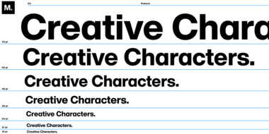
Creative Character: Up and coming.
Creative Characters brings you interviews and discussions with some of the most interesting people working in design and typography today.
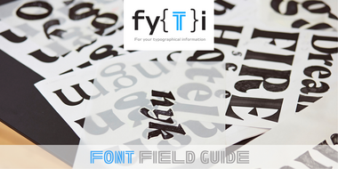
The Font Field Guides are single-page modules that address the most commonly asked questions about typefaces and their use. Each will be dedicated to an important typeface family.

The Manual, is dedicated to important aspects of typographic communication. The modules are concise, easy to read and loaded with illustrations.

Type Trends are a series of interviews conducted on a quarterly basis with design leaders across the global.
Choosing the right font, whether it’s for your resume, a logo, a PowerPoint presentation, or just about any other design project, is crucial to its success. But which font to use?
To answer this question, we asked our font experts to curate the best fonts for some of the most asked-for projects.
The fundamental purpose of writing is to convey ideas. Our ancestors, however, were designers long before they were writers. Their pictures, drawings, and arrangements, played a prominent role in communication from the very beginning.
Perfect Pairings are single-page modules that answer the most common questions about the pairing of typefaces. Each will be dedicated to an important typeface family.